Ranking the states by different methods
Every year, through many different sources, state politicians and political activists make great waves over which state spends more on public education, and which spends less. Who’s in first place? Who’s in last? Those from differing perspectives have different motives. Politicians and anti-tax, anti-government activists search for their way to find that “our states spends more than everyone else and gets nothing for it,” while others hoping to increase education spending search frantically for low ratings – “We’re in last place and that’s a disgrace!” Of course, not everyone can be in first or last place and it’s pretty damn hard to tweak the numbers to move a state from near the top to near the bottom. Here, I’ll present a few alternative, reasonable rankings – the last two of which, I believe are most reasonable, though for some states still differ significantly.
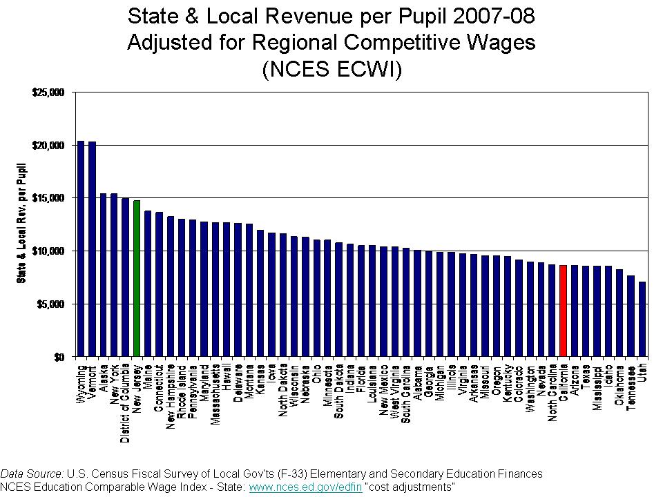
First, let’s begin with the simplest version of the numbers- the straight up averages of school district state and local revenue per pupil (weighted by the number of pupils in each district). Now, I use the state and local revenue per pupil instead of current expenditures per pupil because state and local revenue gives a complete picture of state and local resources allocated to local public school systems and excludes expenditures of federal funds.
Politicians in New Jersey and New York love to make claims that their state is highest spending in the nation (and we get nothing for it!). Even at this most basic level, these claims are wrong. Close, but still wrong. Hooray for Vermont! But isn’t that really part of Canada anyway?
FIGURE 1
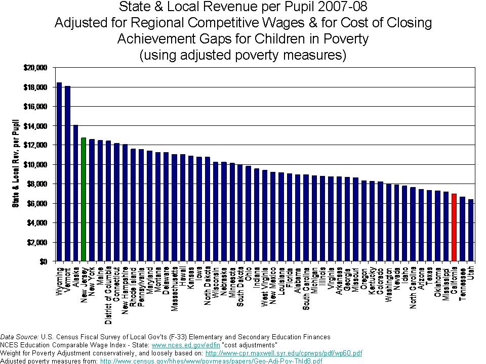
Of course, the cost of running a school varies quite significantly across states with a large share (though not all) of that variation being tied to regional differences in the competitive wage one must pay to teachers. Here, I use a competitive wage index developed by the National Center for Education Statistics (by Lori Taylor and Bill Fowler) which uses variation in non-teacher wages across labor markets to correct for variation in teacher wages. http://nces.ed.gov/edfin/adjustments.asp
FIGURE 2
Some reshuffling occurs. States like California, for example drop quite a bit because California is certainly a more expensive place to live and higher wage state. But, we may be assuming too strong a role for the wage adjustment here – assuming that state and local revenues per pupil should move on a 1 for 1 basis with wage variation. Nonetheless, not a totally unreasonable comparison.
We might also wish to consider the student populations that states must educate with their funding at present levels. That is, how much are these current dollars worth toward achieving common outcomes across students? Many cost factors influence the cost of achieving common outcomes across children, as discussed in this paper –http://surface.syr.edu/cgi/viewcontent.cgi?article=1102&context=cpr – by William Duncombe and John Yinger of the Maxwell School at Syracuse University. But, this particular paper focuses on the additional costs associated with children in poverty. Duncombe and Yinger determine that the additional cost per child falling below the federal poverty line is approximately 150% of the cost of achieving the same outcomes with a non-poor child. They also find that the additional costs associated with counts of children falling below the 185% poverty threshold are approximately 100% above average costs. Now, I go very conservative here, and I apply only a 100% weight of additional cost to children qualifying as being in poverty, using U.S. Census Bureau Small Area Income and Poverty Estimates.
FIGURE 3
But, we’ve been learning more of late about problems with using the same income thresholds for poverty across states with very different costs of living. Recently, the U.S. Census Bureau put out this exceptional paper which includes adjusted poverty measures for each state, based on three different adjustment methods – http://www.census.gov/hhes/www/povmeas/papers/Geo-Adj-Pov-Thld8.pdf. In general, the adjustments lead to much higher actual poverty rates in states with very high costs of living such as New York and California. If we use those poverty rates instead of the previous ones to adjust spending for poverty, we get this:
FIGURE 4
In this case, California moves into 49th place, or third from bottom with Washington DC in the analysis.
We’re still missing a pretty big piece of the puzzle here – additional costs associated with economies of scale and population sparsity (for more information on economies of scale see: http://www-cpr.maxwell.syr.edu/efap/Publications/Revisiting_Economies.pdf). Notice that Wyoming and Alaska are our big spenders here. Now, there’s probably no adjustment we can find to fully account for the many ways in which Alaska is different from the lower 48. Nor do the poverty corrections seem to fully address the difficulties of Washington DC. It’s all pretty imperfect. That said, I take one more stab at things, based on a regression model which attempts to control for a) competitive wage variation, b) economies of scale and population density and c) poverty. The idea here is to account for the fact that some states have a need for very small schools and districts because of their small populations which are spread across vast rural expanses. The model attempts to avoid giving a break to other states like New Jersey or Illinois that have many tiny racially segregated enclaves in densely populated suburbs. And here are the results:
FIGURE 5
An important difference when using a regression model to determine relationships between cost factors and revenue levels – instead of just dividing by the cost factors – is that the model determines the weight of those cost factors. On thing that happens in the figure above is that the influence of wage differentials is “softened.” The model-based projections do not assume a 1 for 1 relationship between competitive wages and revenue. As a result, California does not come out as low as in previous figures. Also, the model is projecting state and local revenues for a district with X% poor children. The projection is for an “equated” condition. But, if the state has far more children in higher poverty settings, and those settings have fewer resources, the model projection does not necessarily reflect the average actual conditions. However, for California in particular, there really isn’t a systematic relationship between poverty and revenues across districts – a finding that is as bad as it might seem good. In fact, it’s just bad!
Aren’t the differences really all about state wealth?
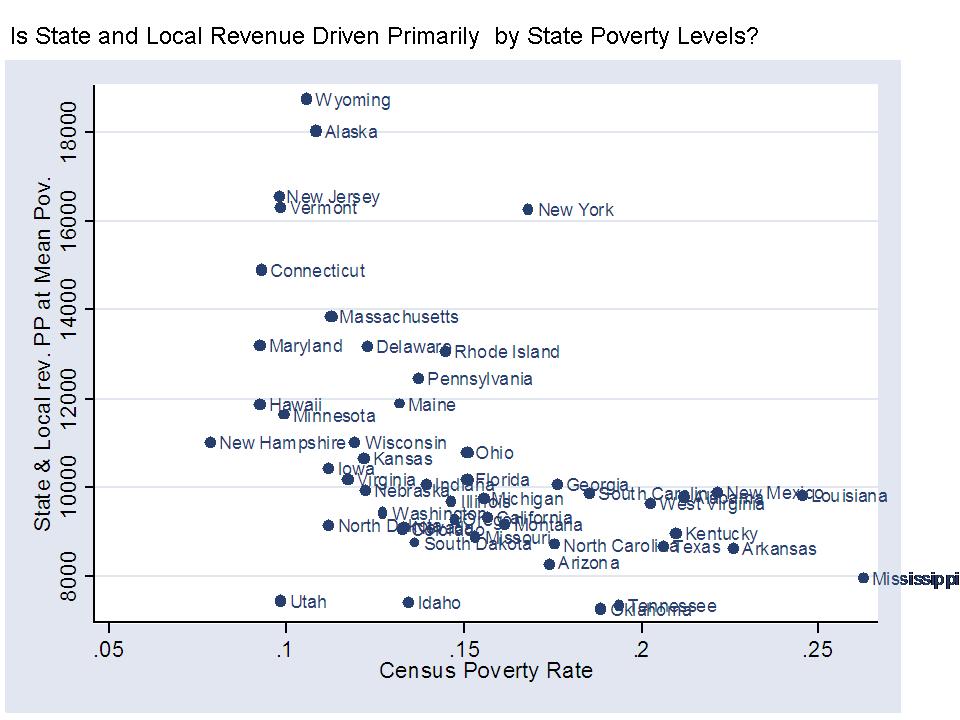
I would be remiss if I didn’t include at least a few ugly scatterplots in this post. So here goes. The first two scatterplots here show that state and local revenues per pupil are somewhat modestly related to state average poverty rates (not adjusted regionally) and to the household income levels of families with children in the public school system.
FIGURE 6
FIGURE 7
However, this final figure shows that state and local revenues per pupil are equally related to the effort a state puts up, where effort is measured in terms of state and local revenue per pupil as a share of gross domestic product by state, or gross state product. That is, some states that don’t raise much revenue per pupil simply don’t try that hard. Very few high spending states have low effort. Tennessee, Louisiana, Oklahoma, Arizona and South Dakota are near the bottom because they don’t put up much effort. Mississippi puts up average effort, but just can’t raise much revenue. I’m far more empathetic to Mississipi’s plight! Well, our highest spender, Vermont in some cases, is off the charts on effort. Despite having less capacity than states like New York or New Jersey, Vermont still manages to outspend them.
FIGURE 8
While it makes great rhetoric to claim “first in the nation” or “last in the nation” or “most expensive,” the best one can really do here is to delineate in terms of relatively high or relatively low. Not great headline stuff, but that’s how it goes. New Jersey – NOT THE HIGHEST IN THE NATION – rather, “relatively high.” California – NOT LAST IN THE NATION – but damn close to it by some measures, and still low by others!


Once again, great stuff, Bruce.
My random thoughts:
http://jerseyjazzman.blogspot.com/2010/10/state-rankings-on-ed-spending.html