No time to really write much here today, but I do have a few figures to share. I’m posting these mainly because I keep seeing so many ridiculous a-contextual… and in many cases simply wrong statements about Chicago teachers’ salaries. As I understand it, salaries are not really the main issue in the contract dispute… but rather… the teacher evaluation system. I’ve already written extensively about the types of teacher evaluation frameworks that I believe are being deliberated here, but I’m not following the issue minute by minute.
This post may be most relevant!
Someone has to just say no to ill-conceived teacher evaluation policies. Perhaps this is the time.
That aside, there are typically two ways one might choose to compare teacher salaries to determine how they fit into their competitive context. One is to compare teacher salaries to non-teachers of similar age and education level. The overall competitiveness of teacher salaries tends to influence the quality of entrants to the profession. The other is to compare teacher salaries – for similar teachers – across districts within the same labor market.
When taking the latter approach, it is also important to consider the demographic differences across settings. All else equal, teachers will gravitate toward jobs with more desirable working conditions. So, in high need urban settings, equal compensation alone would be insufficient.
Bear in mind that I’ve explained on numerous previous posts how Chicago is among the least well funded large urban districts in the nation!
So, here’s a quick run-down on salaries and student populations – and funding equity (or lack thereof) – in pictures and tables.
Figure 1. Concentration of Predominantly Black and Hispanic Schools and Low Income Districts (and resource inequity)
[this paper explains the model behind the funding disparity analysis]
Figure 2. Demographics of Selected School Districts
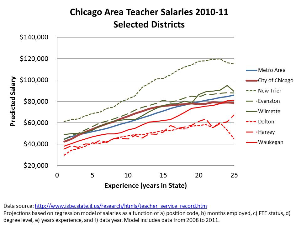
Figure 3. Salary by Experience Generated from Model of Teacher Level Data (publicly available here)
So, in the mix, Chicago salaries for the first several years of experience are relatively average – or even slightly above. But, they do trail off at higher levels of experience and eventually fall behind. Remember though that comparable salaries would be generally insufficient for recruiting/retaining comparable teachers in a higher need setting.
Other even higher poverty, higher minority concentration districts like Harvey and Dolton are even more disadvantaged in terms of teacher salary competitiveness.
For more on the importance of teacher salaries, see: http://www.shankerinstitute.org/images/doesmoneymatter_final.pdf
Cheers!
ADDENDUM
I’ve been fielding a few random comments along the lines of “so what… Chicago’s outcomes still stink and they clearly spend more than they should, and pay their teachers more than they should for those stinky outcomes!” Some of these comments point to higher graduation rates in Springfield, coupled with lower spending. Of course, this comparison assumes that it would cost the same in Springfield and Chicago to accomplish similar outcomes. So, I ran a check based on models I’ve run for recent academic papers. The models are fully elaborated here:
Baker.AEFP.NY_IL.Unpacking.Jan_2012
Specifically, I estimate models to adjust for the various costs faced by districts toward achieving common outcome goals. Those models account for differences in the student population served, differences in regional labor costs and differences in economies of scale (really only affects small districts).
These graphs show the relationship between need and cost adjusted operating expenditure per pupil and student outcome measures. The first uses the state assessment scores, centered around the average district – and averaging these centered scores across all grades and tests. It’s like a combined outcome index of all test scores.
 Chicago falls pretty much in line here. It has very low need/cost adjusted spending… and, well… low outcomes. But they certainly don’t appear to have lower outcomes than expected given their resources!
The second uses graduation rates.
 It’s a little harder to judge what’s going on here… but Chicago still does not appear to be substantially out of line. Graduation rates can vary for any multitude of reasons… including having lower standards for graduation.
In other words, I’m not buying the argument that “yeah… but… Chicago still ain’t cuttin’ it… even with what it has.” Is it possible to have what you need and still not cut it? Yes. It is certainly possible that a district would have far more adequate resources and still do a crummy job. But, Chicago does not appear to be such a case.


Thanks. You do the best job of getting relevant, accurate (and context full) information out there. I just wish that more of the information you put out there got included in the national discourse.
CG
How does the student-teacher ratio compare in these districts? If $40,000/year CPS teachers have 30 kids in their class and $60,000/year New Trier teachers only have 15-20, that also seems like relevant info.
If I get a chance, I’ll take a look. But I certainly agree that those are important differences in working conditions.
Reblogged this on Westhill District Education Assoc. and commented:
Poverty matters in education. Take a look at these maps of District poverty concentrations and funding inequities.
Thanks–you are invaluable.