We’ve all now had a few days to digest the findings of the most recent KIPP middle school mega-study. I actually do have some quibbles with the analyses themselves and the presentation of them, one of which I’ll address below, but others I’ll set aside for now. It is the big picture lessons that are perhaps most interesting.
I begin this post with a general acceptance that this study, like previous KIPP studies, and like studies of charter effectiveness in markets generally characterized by modest charter market share and dominance of high flying charter chains, typically find that the kids attending these charters achieve marginal gains in math, and sometimes reading as well (as in the new KIPP study). These findings hold whether applying a student matching analysis or lottery based analysis (though neither accounts for differences in peer group).
In the past few years, we’ve heard lots of talk about no excusesness and its (supposed) costless (revenue neutral) effectiveness and potential to replace entire urban school systems as we know them (all the while reducing dramatically the public expense). But the reality is that what underlies the KIPP model, and that of many other “high flying” no excuses charter organizations, are a mix of substantial resources, leveraged in higher salaries, additional time – lots of additional time (and time is money) and reasonable class sizes, coupled with a dose of old-fashioned sit-down-and-shut up classroom/behavior management and a truckload of standardized testing. Nothin’ too sexy there. Nothin’ that reformy. Nothin’ particularly creative.
The brilliant Matt Di Carlo of Shanker Blog shared with me this quote in e-mail exchanges about the study yesterday:
In other words, the teacher-focused, market-based philosophy that dominates our public debate is not very well represented in the “no excuses” model, even though the latter is frequently held up as evidence supporting the former. Now, it’s certainly true that policies are most effective when you have good people implementing them, and that the impact of teachers and administrators permeates every facet of schools’ operation and culture. Nonetheless, most of the components that comprise the “no excuses” model in its actual policy manifestation are less focused on “doing things better” than on doing them more. They’re about more time in school, more instructional staff, more money and more testing. I’ve called this a “blunt force” approach to education, and that’s really what it is. It’s not particularly innovative, and it’s certainly not cheap.
Expanding on Matt’s final comment here, our report last summer on charter schools found specifically that the costs of scaling up the KIPP model, for example, across all New York City or Houston middle schools would be quite substantial:
Extrapolating our findings, to apply KIPP middle school marginal expenses across all New York City middle school students would require an additional $688 million ($4,300 per pupil x 160,000 pupils). In Houston, where the middle school margin is closer to $2,000 per pupil and where there are 36,000 middle schoolers, the additional expense would be $72 million. It makes sense, for example, that if one expects to find comparable quality teachers and other school staff to a) take on additional responsibilities and b) work additional hours (more school weeks per year), then higher wages might be required. We provide some evidence that this is the case in Houston in Appendix D. Further, even if we were able to recruit an energetic group of inexperienced teachers to pilot these strategies in one or a handful of schools, with only small compensating differentials, scaling up the model, recruiting and retaining sufficient numbers of high quality teachers might require more substantial and sustained salary increases.
But, it’s also quite possible that $688 million in New York or $72 million in Houston might prove equally or even more effective at improving middle school outcomes if used in other ways (for example, to reduce class size). Thus far, we simply don’t know.
Baker, B.D., Libby, K., & Wiley, K. (2012). Spending by the Major Charter Management Organizations: Comparing charter school and local public district financial resources in New York, Ohio, and Texas. Boulder, CO: National Education Policy Center. Retrieved [date] from http://nepc.colorado.edu/publication/spending-major-charter.
Here’s a link to my rebuttal to the rather disturbing KIPP response to our report.
In a recent paper, I continue my explorations of the resource (and demographic) differences of charter schools and their urban contexts. In particular, I’ve been trying to get beyond just looking at aggregate per pupil spending and instead, digging into differences in tangible classroom resources. Here are some related findings of my current paper co-authored with Ken Libby and Katy Wiley.
Baker.Libby.Wiley.Charters&WSF.FEB2013
Finances
Table 5 shows the regression results comparing the site based spending per pupil of charters by affiliation, with New York City district schools serving similar populations, the same grade levels and in the same borough. When comparing by % free or reduced lunch, where KIPP schools are more similar to their surroundings, KIPP schools spent about $4,800 more per pupil. When comparing by % free lunch alone, where KIPPs have lower rates than many surrounding schools, KIPP schools spent more than $5,000 more per pupil.

Table 6 shows similar analysis for the Houston Texas area, including schools in surrounding districts which overlap Houston City limits. Splitting KIPPs by those that serve elementary grades (Iower) versus those serving middle (and some upper) grades, This table shows that KIPPs serving lower grades spent marginally less than district schools. KIPPs serving middle/upper grades spent over $3,000 per pupil more.

Specific Resource Inputs
This figure shows the relative salaries of teachers, both on an annual basis and equated for months on contract in New York City. KIPP teachers at same degree and experience level were paid about $4,000 more than district teachers. Equating contract months KIPP teachers were paid about the same as district teachers. But the central point here is that KIPP teachers were paid more for the additional time. That said, it would appear that teachers in some other NYC charters were paid even more than KIPPs at same degree and experience level.
Figure 1. Relative Salaries in New York City

Here’s a plot of teacher salaries by experience level in Houston Texas. KIPP teachers across the range of experience receive a substantial salary premium for their time and effort.

Figure 2. Relative Salaries in Houston
As I’ve said before. This simply makes sense. This is not a critique. These graphs are constructed with publicly available data – the New York State Personnel Master File and the Texas equivalent. I would argue that what KIPP schools are doing here is simple and logical. They are providing more time to get kids further along and they are acknowledging through their compensation systems that if you want to get sufficient quality teachers to provide that additional time, you’re going to have to pay a decent wage.
Finally, here’s a plot of the relative class sizes in New York City, also constructed by regression analysis accounting for location and grade range.
Figure 3. Relative Class Sizes in New York City

An “are you kidding me?” moment
There was one point in reading the KIPP report that my head almost exploded. This was where the authors of the report included a ridiculously shoddy analysis in order to brush off claims of cream-skimming. In figure ES.1 of the report, the authors make the argument that it is clear that KIPP schools are not cream-skimming more desirable students by comparing KIPP student characteristics to those of all students in the schools from whence the KIPP students came.
Figure ES.1. The Non-Proof of Non-Creamskimming

The authors are drawing this bold conclusion while relying on but a handful of extremely crude dichotomous characteristics of students. They are assuming that any student who falls below the 185% income threshold for poverty is equally poor (whether in Arkansas or New York). But many of my prior analyses have shown that even if we take this dichotomous variable and make it, say, trichotomous, we may find that poorer kids (<130% income threshold) are less likely to sort into charter schools (more below). It is equally if not even more problematic to use a single dummy variable for disability status – thus equating the charter enrolled child with speech impairment to the district enrolled child with traumatic brain injury. The same is likely true of gradients of language proficiency.
The problems of the crudeness of classification are exacerbated when you then average them across vastly disparate contexts. IT WOULD BE ONE THING if the authors actually threw some caveats about data quality and available and moderated their conclusions on this basis. But the authors here choose to use this ridiculous graph as the basis for asserting boldly that the graph provides PROOF that cream-skimming is not an issue.
Look, we are all often stuck with these less than ideal measures and must make the best of them. This example does not, by any stretch make the best of these inadequate measures. In fact, it makes them even worse (largely through their aggregation across disparate contexts)!
An Alternative look at Houston and New York
I don’t have the data access that Mathematica had for conducting their study. But I have, over time, compiled a pretty rich data set on finances of charter schools in New York and Texas from 2008 to 2010 and additional information on teacher compensation and other school characteristics. Notably, I’ve not compiled data on all of the KIPP charters in California, or all of the KIPP charters in Arkansas, Oklahoma, Tennessee or elsewhere. I’ve focused my efforts on specific policy contexts. I’ve done that, well, because… context matters. Further, I’ve taken the approaches I have in order to gain insights into basic resource differences across schools, within specific contexts.
The following two tables are intended to make a different comparison than the KIPP creamskimming analysis. They are intended to compare KIPP, and other charter schools in these city contexts with the other schools serving same grade level students. That is, they are intended to compare the resulting peer context, not the sending/receiving pattern. It’s a substantively different question, but one that is equally if not far more relevant. I use regression models to tease out differences by grade range and within New York City, by location.
Table 3 shows that KIPP schools have relatively similar combined free/reduced lunch shares to other same grade schools in New York City (in the same borough). But, Table 3 also shows that KIPP schools have substantively lower % free lunch share (13% lower on average, but with individual schools varying widely). Table 3 also shows that KIPP schools have substantively lower ELL (11% fewer) and special education (3% fewer) populations in New York City.
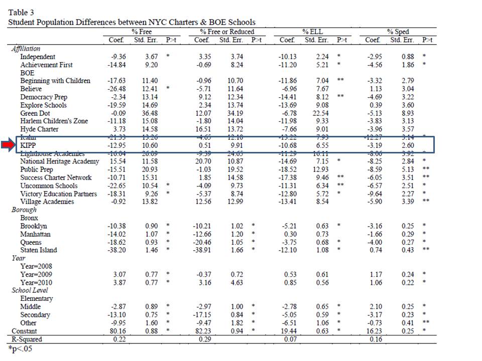
Table 4 shows the results for the Houston area, and this is why context is important to consider. While I would argue that New York City KIPPs do show substantial evidence of income related cream-skimming as well as ELL and special education, I can’t say the same across the board in Houston. Then again, I don’t have the free/reduced breakout in Houston. In Houston, the KIPPs do have lower total special education (and I’m unable to parse by disability type – which is likely important). KIPP middle schools in Houston appear to have higher free/reduced lunch share than middle schools in/around Houston.

Differences between Houston and New York and for that matter every other KIPP context are masked by aggregation across all contexts, yet these differences may be relevant predictors of differences in KIPP success that may exist across these contexts.
Note that Houston and New York are non-trivial shares of the total KIPP sample. Here’s my run of KIPPs by state and by major city, using the NCES Common Core of Data 2010-11.


Why are the standard errors so large in tables 3 and 4 for KIPP?
variation across schools… with very small sample size of schools within any city/borough. Really, these regressions are descriptive… of actual averages by the subgroups (covariates) in the models. they are descriptive regressions of the universe of data on these cities. Therefore, the significance tests really have little/no meaning. They are actual averages (albeit modeled by regression analysis)… not averages of a sample that must then be projected to the population.
Thanks!
class size DOES matter!!
Well, not sure I said that definitively here… but I did point that out here: http://www.shankerinstitute.org/images/doesmoneymatter_final.pdf
Thanks for sharing this analysis of KIPP versus their competing schools in NYC and Houston. Very helpful! I do wish you would have written a concluding paragraph or two summarizing the major takeaways. It was a very good article.
Bob
One important point is that the selectivity issue really can’t be measured with data.
I researched it several years ago, as an education blogger, by putting my own child into the application process for KIPP San Francisco Bay Academy. We followed the process through only as far as the point that the school contacted us to schedule her pre-“lottery” test.
Yes, test.
I put “lottery” in quotes because that particular KIPP school actually struggles to fill its seats, so it doesn’t need to use a lottery.
I was told that the test was used to determine what grade the student would be placed in (or placed in the lottery for, should there be one).
The key point here is that the KIPP application process and the requirements for attending the schools self-select for students who are compliant and motivated and who come from compliant, motivated and supportive families. I can’t see any way to measure those factors with data.
Writer Malcolm Gladwell wrote about KIPP in his book “Outliers,” and clearly portrayed that, though he appeared oblivious to what he was showing us. He quoted a KIPP student as saying her friends from the neighborhood wouldn’t go to her school because they weren’t willing to work that hard.
Methinks you protest too much on the cream-skimming graph. As you don’t deny, the KIPP kids have lower average test scores to start out with, so if they or their families have some heroic level of motivation and skill, that certainly wasn’t showing up in their test scores beforehand.(Note: this also makes it hard to credit the speculation that even under the FRL line, they have higher income in any way that would be relevant to academic achievement).
The creamskimming graph would be much less bad if not aggregated across these vastly disparate contexts, where the poverty measure just can’t be uniformly applied. Then, in specific contexts, like NYC, we know these specific dummy variables to be insufficient. Aggregating their test scores across the contexts may be equally problematic, but I don’t know/have all the details necessary. The special education dummy variable, as I’ve shown in other contexts is also really problematic. So, for them to draw the conclusion they did, a) using that special ed variable with no insights into classification and b) using the free/reduced measure and THEN, aggregating that measure across contexts that are totally different, is ridiculous.
Separately… there’s a lot of interesting stuff in the study. They didn’t have to go there. They didn’t have to do a half-assed comparison of this type to brush off an issue that likely varies widely by context. This graph and how poorly the underlying analysis for it is done – and how bold a conclusion they draw from it… with little or no purpose… cheapens an otherwise solid and interesting paper.
It’s a lot like what I saw here, in their CMO report: https://schoolfinance101.wordpress.com/2011/11/06/mpr%E2%80%99s-unfortunate-sidestepping-around-money-questions-in-the-charter-cmo-report/
It’s just goofy.
Just call me Stuart, not Dr. Buck.
My only point is that if KIPP’s students’ overall starting test scores are lower, then any supposed advantage they have from other factors (whether they are “free” or only “reduced” lunch, whether they’re less likely to have that 1-in-10,000 brain injury, whether they have a higher level of motivation, or whatever) obviously must not be that much of an advantage after all.
Otherwise, they would have already shown up at KIPP with higher scores.
In other words, I don’t see how one can maintain the following three propositions at the same time: 1) KIPP students/families are being cream-skimmed, in that they have higher motivation [or less poverty] to start with than their peers. 2) Having higher motivation [or less poverty] is an advantage in producing higher achievement. 3) Nonetheless, KIPP students start out with lower average achievement than their peers.
We know (3) is true on average (however nice it might be to see school-level stats). LIke it or not, that is what the evidence states. Therefore either (2) or (1) can’t be true, at least not in the strong sense that KIPP critics would prefer to believe.
To clarify… my main point is that I’m not maintaining that All KIPPs in all markets uniformly creamskim. In some markets they clearly do. In others perhaps not. Regarding special ed, in most they do. We don’t know from this study, or this figure, in which markets with which schools there was creamskimming and we don’t know the extent that more creamskimmed schools drove the overall effect (again, like the Newark effect in the NJ CREDO study. Newark drove the whole effect. Newark charters heavily skim, others around the state, less so [except in Hoboken & Jersey City, where they creamskim]).
Note also that a good number of KIPPs, including in Kansas City (with less than stellar reputations) are not even included here. There’s a lot of missing information here… and there’s a lot of hyper-aggregation that really masks important nuances, making the findings very unhelpful from a policy perspective. Note also that “motivation” per se is captured only by choice to enter a lottery, and only comparable a) among those schools studied on a lottery basis, b) doesn’t address peer group motivation or whether there is selective attrition by motivation – or selective attrition by motivation of the peer group. These are substantive caveats.
Finally, I’ve not in my post suggested that these caveats negate entirely the KIPP effect. I’d like to see it parsed more carefully, especially by market… given the current approach assumes a counterfactual of a monolithic public schooling alternative from Houston, to NOLA to NYC to Boston, and thus also assumes (the study doesn’t but the pundit response certainly does) scalability of the treatment to be similar across these vastly disparate settings (even though we don’t even know if the schools were comparably effect in all). Does access to higher quality teacher labor in a given market matter? Or is their recruitment sufficiently national? How did the relative performance of the public system affect the likelihood that KIPPs could show advantage? it might be easier to beat the odds in California than in other locations. it might be easier to beat the odds in CA or NOLA, even with needier students than the district schools, given the KIPP resource advantage. But, it may be harder to beat the odds in NYC or Boston. Not sure. Creamskimming, peer effect & selective attrition may play some role here along with substantial resource advantage. Study unhelpful in this regard. I understand that this was probably the charge given to MPR by funders – study overall KIPP effect – don’t disaggregate in ways that might reveal specific school performance.
Finally, consider that lottery based analyses are only a marginal improvement over the matched pair approach. Neither addresses contextual differences such as peer group composition or changes to peer group composition by selective attrition. Lottery studies involve randomization at one single point in the process and like matched pair studies then assume any/all effects to be lumped into “school” effect. https://schoolfinance101.wordpress.com/2012/12/20/thoughts-on-randomized-vs-randomized-charter-school-studies/
& it is a substantial stretch to keep using the phrase “similarly motivated” when comparing lottery winners and lottery losers. Perhaps losing the lottery was sufficient disappointment to dampen their actual motivation, especially when put back into a less advantaged peer group, perhaps even along with other lottery losers. Call them lottery winners, lottery losers. No… this isn’t you… it’s the study… and it’s the emerging lingo of such studies. But there is NO measure of “motivation” here at all – certainly no measure of actual post-lottery motivation to achieve in school. But I do accept that it makes the lottery approach marginally different from matching students on crude parameters who may or may not have even tried to enter the charter pool. I’m just not convinced of how that effect swings.
In response to Stuart:
Stuart’s comment: “I don’t see how one can maintain the following three propositions at the same time: 1) KIPP students/families are being cream-skimmed, in that they have higher motivation [or less poverty] to start with than their peers. 2) Having higher motivation [or less poverty] is an advantage in producing higher achievement. 3) Nonetheless, KIPP students start out with lower average achievement than their peers.”
I haven’t seen an answer to this question: when we say KIPP students start out with lower average achievement than their peers, do we mean all peers in a grade, or demographically matched peers? This is a data issue, so can anyone confirm? Dr. Baker?
But here’s the other point. I believe it’s quite likely that students who are motivated and compliant and who have motivated, compliant and supportive families could be much more successful in a setting where they are not in contact with more-troubled, higher-need, possibly disruptive, defiant and oppositional peers.
I believe that this is what people like Petrilli, rejecting the years of obfuscation and flat-out lying about the creaming effect, are now saying. It seems like this could be an extremely valuable lesson — could be replicated and scaled — and could be studied easily IF the obfuscation and lying about the situation would cease.
I believe they mean lower average scores than other students attending the same feeder schools. That’s certainly what they are saying in the graph I criticized. Which, of course, does not mean lower average scores than those that matriculated to comparison schools – or more precisely, schools of comparisons students. WE have to keep in mind that among all the students in urban feeder elementary schools, when it comes to middle schools, some are going to go to KIPPs, some are going to other charters, some are going to private schools (middle school and the shift from neighborhood schooling being a common breakpoint) and some are going to district middle schools. The feeder school comparison can be deceptive in many ways – not necessarily intentionally, but because it often gets interpreted incorrectly.
So here in San Francisco, all the K-5s are potentially feeder schools to the two KIPP schools. Is that not the case in other districts? Since KIPP schools are charters and charters have voluntary admissions, there wouldn’t be any designated feeder schools, correct? So how does that “feeder school” stipulation apply?
Again referring to SFUSD, the students who would be the target market (if I may use that term) of the KIPP schools would be from demographics that (overall on average) scores considerably lower than other students in the district. Our district is plurality Chinese, and Chinese students (overall on average) have high achievement. Our KIPP schools attract few Chinese students and target African-American and Latino students. (Our city has a small African-American population and a significant Latino population.)
If the question is whether KIPP attracts students who are lower scorers than other students in their demographic subgroup, yet the data aren’t clear on the comparison group, the best way to judge would be to look at one of those entirely black/Latino, entirely high-poverty districts that I know exist elsewhere in the nation — Detroit or one of the really depressed New Jersey cities?
In any case, those who applaud KIPP schools are now telling two different stories, because Stuart is still insisting that they don’t cream, while Michael Petrilli is acknowledging that they do cream and applauding the fact. And I know from my personal investigation that at least some KIPP schools give tests as part of the application process (the paid working press could and should have done this investigation, but failed to, by the way), so how would that NOT have a creaming effect?
I agree that seeing more fine-grained information would be great.
I have to quibble with the idea that schools with more cream-skimming might be driving the results. Is that possible given Table D-5, which shows that KIPP’s effect on especially low-scoring kids is greater than its effect on especially high-scoring kids?
At this level of aggregation, I’m just not sure what to think… how to interpret, including the general point about lowest scoring kids. One could certainly rationalize that both the additional time/resources and being placed in a strong peer group is most advantageous for low performing kids in particular.
@Stuart Buck, your own colleagues in the so-called “reform” sector, such as Petrilli, have begun to acknowledge the “creaming” effect quite openly (and celebrate it).
I believe Stuart was merely trying to suggest that I’ve perhaps made too big a deal of the cream-skimming graph in this report (and we’ve interacted on this topic on numerous occasions). For me, this graph raises questions about the overall quality of the report – questions that would have been lessened had the graph simply not been there. As for evaluating cream-skimming, I stick to my central point that it isn’t that helpful to evaluate cream-skimming with such crude measures… and it’s particularly ridiculous to aggregate across all of these settings. Cream-skimming, based on my various analyses, is far more pervasive in some charter markets, and among some charter operators. One thing we can’t tell from the present study is whether much of the positive effect is driven by those markets where there is greater creamskimming. And that graph DOES not tell us whether there is equal balance of cream-skimming vs. non-creamskimming (or even reverse). Measures too imprecise. In the New Jersey CREDO study, the positive charter effect was entirely attributable to Newark Charters, where there is the greatest creamskimming (over-the-top creamskimming).
I’ve had many exchanges with Dr. Buck too, in all of which he angrily denied that there was any cream-skimming going on at all, in any way. So it’s newsworthy that his colleagues now have changed their story and openly acknowledge (and celebrate it). That’s irrelevant to discussion of data, I realize.
At least in Texas, KIPP clearly skimmed students with respect to those new entrants to KIPP in the 5th or 6th grade.
See http://fullerlook.wordpress.com/2012/08/23/tx_ms_charter_study/
What is most stunning is that “poor kids” entering KIPP dramatically outperformed poor kids from sending schools and neighborhood schools. At least in Texas, KIPP skimcreams pretty effectively, although not as effectively as YES Prep or Harmony.
Ed — quick question. Your chart shows that kids entering KIPP in 5th grade in Texas had 4th grade math scores that were .051 standard deviations higher than their peers, not very much. But then Table 5 breaks this down into “all students” vs. “economically disadvantaged” students, the latter of whom were supposedly scoring fully .26 standard deviations higher in 4th grade math before they got to KIPP.
Given that KIPP students are about 90% economically disadvantaged in Texas, the only way you could get an overall 4th grade math z-score of .051 would be if the non-poor kids were an incredible 1.8 standard deviations below their peers in 4th grade math..
Any theories for how that would come about?
Stuart–the title of the graph was incorrect for eco dis students. The comparison group for the grey/purple eco dis analysis was 4th grade scores for students entering KIPP and not entering KIPP in the 5th grade for all students in schools within the same zip or contiguous zip codes as KIPP.
An apples-to-apples comparison would be:
All Students (not enrolled in KIPP in the 4th grade)
KIPP Zip + Contiguous Zips -0.041
KIPP -0.014
DIFF (KIPP – KIPP Zip+) +0.027
All Eco Dis Students (not enrolled in KIPP in the 4th grade)
KIPP Zip + Contiguous Zips -0.194
KIPP +0.069
DIFF (KIPP – KIPP Zip+) +0.263
So, for students entering KIPP in the 5th grade (excluding 4th grade KIPPsters), eco dis students had greater 4th grade TAKS scores than their non eco dis peers. Not eco dis students not entering KIPP had far greater 4th grade TAKS scores than eco dis students.