A while back, in a report from the NJDOE, we learned that outliers are all that matters. They are where life’s important lessons lie! Outliers can provide proof that poverty doesn’t matter. Proof that high poverty schools – with a little grit and determination – can kick the butts of low poverty schools. We were presented with what I, until just the other day might have considered the most disingenuous, dishonest, outright corrupt graphic representation I’ve seen… (with this possible exception)!
Yes, this one: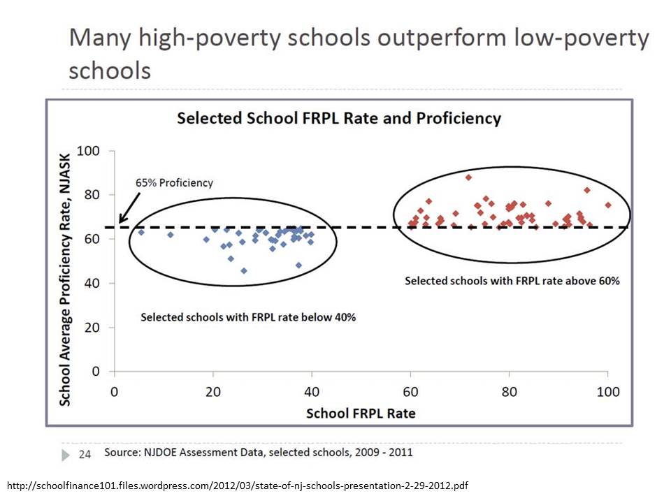 This graph was originally presented by NJ Commissioner Cerf in 2012 as part of his state of the schools address. I blogged about this graph and several other absurd misrepresentations of data in the same presentation here & here.
Specifically, I showed before that the absurd selective presentation of data in this graph completely misrepresents that actual underlying relationship, which looks like this:
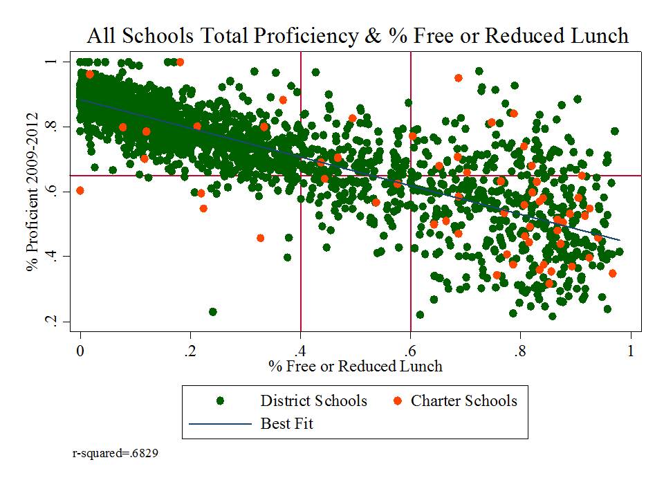 Yep, that’s right, % free or reduced priced lunch alone explains 68% of the variation in proficiency rates between 2009 and 2012 (okay, that’s one more year than in the misleading graph above, but the pattern is relatively consistent over time).
But hey, it’s those outliers that matter right? It’s those points that buck the trend that really define where we want to look…what we want to emulate? right?
Actually, the supposed outliers above are predictably different, as a function of various additional measures that aren’t included here. But that’s a post for another day. [and discussed previously here]
THEN came the recent report on progress being made on teacher evaluation pilot programs, and with it, this gem of a scatterplot:

This scatterplot is intended to represent a validation test of the teacher practice ratings generated by observations. As reformy logic tells us, an observed rating of a teacher’s actual classroom practice is only ever valid of those ratings are correlated with some measure of test score gains.
In this case, the scatterplot is pretty darn messy looking. Amazingly, the report doesn’t actually present either the correlation coefficient (r) or coefficient of determination (r-squared) for this graph, but I gotta figure in the best case it’s less than a .2 correlation.
Now, state officials could just use that weak correlation to argue that “observations BAD, SGP good!” which they do, to an extent. But before they even go there, they make one of the most ridiculous statistical arguments I’ve seen, well… since I last wrote about one of their statistical arguments.
They argue – in picture and in words above – that if we cut off points from opposite corners – lower right and upper left – of a nearly random distribution – there otherwise exists a pattern. They explain that “the bulk of the ratings show a positive correlation” but that some pesky outliers buck the trend.
Here’s a fun illustration. I generated 100 random numbers and another 100 random numbers, normally distributed and then graphed the relationship between the two:
 And this is what I got! The overall correlation between the first set of random numbers and second set was .03.
Now, applying NJDOE Cerfian outlier exclusion, I exclude those points where X (first set of numbers) >.5 & Y (second set)<-.5 [lower right], and similarly for the upper left. Ya’ know what happens when I cut of those pesky supposed outliers in the upper left and lower right. The remaining “random” numbers now have a positive correlation of .414! Yeah… when we chisel a pattern out of randomness, it creates… well… sort of… a pattern.
Mind you, if we cut off the upper right and lower left, the bulk of the remaining points show a negative correlation. [in my random graph, or in theirs!]
But alas, the absurdity really doesn’t even end there… because the report goes on to explain how school leaders should interpret this lack of a pattern that after reshaping is really kind of a pattern, that isn’t.
Based on these data, the district may want to look more closely at its evaluation findings in general. Administrators might examine who performed the observations and whether the observation scores were consistently high or low for a particular observer or teacher. They might look for patterns in particular schools, noting the ones where many points fell outside the general pattern of data. These data can be used for future professional development or extra training for certain administrators. (page 32)
That is, it seems that state officials would really like local administrators to get those outliers in line – to create a pattern where there previously was none – to presume that the reason outliers exist is because the observers were wrong, or at least inconsistent in some way. Put simply, that the SGPs are necessarily right and the observations wrong, and that the way to fix the whole thing is to make sure that the observations in the future better correlate with the necessarily valid SGP measures.
Which would be all fine and dandy… perhaps… if those SGP measures weren’t so severely biased as to be meaningless junk.
 Yep, that’s right – SGP’s at least at the school level, and thus by extension at the underlying teacher level are:
- higher in schools with higher average performance to begin with in both reading and math
- lower in schools with higher concentrations of low income children
- lower in schools with higher concentrations of non-proficient special education children
- lower in schools with higher concentrations of black and Hispanic children
So then, what would it take to bring observation ratings in line with SGPs? It would take extra care to ensure that ratings based on observations of classroom practice, regardless of actual quality of classroom practice, were similarly lower in higher poverty, higher minority schools, and higher in higher performing schools. That is, let’s just make sure our observation ratings are similarly biased – similarly wrong – to make sure that they correlate. Then all of the wrong measures can be treated as if they are consistently right???????
Actually, I take some comfort in the fact that the observation ratings weren’t correlated with the SGPs. The observation ratings may be meaningless and unreliable… but at least they’re not highly correlated with the SGPs which are otherwise correlated with a lot of things they shouldn’t be.
When will this madness end?

What does the acronym FRPL stand for in the first graph?
Free and Reduced Percentage Lunch??
yep…. as far as I can tell… their graph… not mine (though I’m not always as clear as I should be).
Well, a bad acronym for bad thinking then. FRLP would be better Free and Reduced Lunch Percentage. But when obfuscation is your game it permeates your thinking on all levels.
I didn’t read your comment right before. It means Free and Reduced Priced Lunch… where FRPL is the common way of abbreviating.
This misuse of mathematical statistics by the DOE makes me ill but I love the “Cerfian outliers”!!!
Another classic, Bruce. Very familiar to us all.
Bruce, Its not going to end. I would put a lot of money on the line that most (if not all) of the DOE “leaders” who make decisions and recommendations based on these ridiculous claims can not follow your not so complicated stats analysis. Its going to get worse before it gets better as more states fall in line with the “accountability” bandwagon and more statistically challenged “leaders” have to start defendning their management decision and reform plans based on them. When funds are conditional on compliance with bad accountability measures it doesn’t matter that they are invalid. It’s take the money or…don’t. And don’t is difficult for poor districts and states. In Puerto Rico, where absolutely not one of the state leaders (from the Chancellor down) understood ANY statistics, or of the insurmountable problems with the accountability measures they were trying to replicate (that were in many ways way superior than anything we could possible construct), they were forcing the issue of school, teacher, principal eval measures because the FEDED said we had to – despite data quality problems at all levels that were known to be so bad as to be worthless (and in many cases constructed in ways as to be fraudulent). The outside consultants hired to set these systems up were sucking up the ARRA and SIG funds like you can’t imagine. And the music just kept playing with companies of the major donors of the government party being the recipients of much of this largess…with hyperinflated prices for the hardware, and per hour consultant fees that were a days worth of teacher salaries, etc, etc. – work done by people with NO competence, experience or training in education…corporate vampires who needed to guided on how to calculate attendance rates on a per capita basis (I kid you not)….
Some other layers. A 2013 review of research bearing on Student Growth Objectives/Student Learning Objectives (SGO/SLOs) concluded that no studies provide evidence of the reliability or validity of this process for teacher evaluation. No studies provide evidence that the stated objectives for students, if achieved, can be attributed only to the influence of the teacher. All studies documented unresolved issues in the validity, reliability, and fairness of SLOs for high-stakes evaluations of teachers in a wide range of subjects and job assignments. See: Gill, B., Bruch, J., & Booker, K. (2013). Using alternative student growth measures for evaluating teacher performance: What the literature says. (REL 2013–002). Washington, DC: U.S. Department of Education, Institute of Education Sciences, National Center for Education Evaluation and Regional Assistance, Regional Educational Laboratory Mid-Atlantic. Retrieved from http://ies.ed.gov/ncee/edlabs. Notice that this review was conducted for the USDE.
Nevermind, USDE still promotes this flawed process through spin doctors. Case 1:
USDE has channeled money to public relations experts in its Reform Support Network. One recommendation calls for states and districts to enlist “teacher SWAT teams that can be deployed for teacher-to-teacher communication at key junctures of the implementation and redesign of evaluation systems“ in order to develop buy-in to the agenda p. 9. See: Reform Support Network. (2012, December). Engaging educators: Toward a new grammar and framework for educator engagement. Author. Retrieved from www2.ed.gov/about/inits/ed/implementation…/engaging-educators.pdf
Case 2. A USDE-funded “research center” tries to explain and justify value-added estimates and SGO/SLOs with a PowerPoint presentation using the analogy of a gardener influencing the growth of an oak tree. This explanation seems innocent enough but unlike trees, students have the capacity to think and act independently and they are influenced by an array of people, events, and beliefs not confined to teachers and the school. Educators typically attend to students as persons; not as trees and not as data points in the area under a bell curve. See Value-Added Research Center. (2012). Teacher effectiveness initiative, value-added training oak tree analogy. Madison: University of Wisconsin. Retrieved from varc.wceruw.org/…/Oak%20Tree%20Analogy%20with%20notes%20- %20Bush.pptx
Laura – Your links don’t work anymore (USDOE). Can you provide accurate ones? I am very interested in accessing. Thanks
In the final epac report p.40-“A preliminary analysis of principal data suggests that districts were able to differentiate between different levels of principal performance quite well. Compared to the first year of teacher pilot data where districts produced a majority of Effective and Highly Effective ratings, several principal pilot districts generated much more normally distributed data.”
Who is to say that the data should be normally distributed? If you gave a 9th grade math test to mathematics teachers would that be normally distributed? Why should one assume that teachers ratings should be normally distributed?
Bruce, I have always admired the sharpness of your intellect and depth of your research. Respectfully, I think that you are way off-base here. In the past few months your treatment of anything from Cerf’s office has gotten increasingly shrill, and I don’t think it suits you.
I clicked through to the DOE report and looked for the slide in question. Here’s how that slide is introduced: “Several districts inspected their data to identify patterns across and within schools. For example, when discrepancies in SGP and practice measures did occur, they used the data to evaluate rater accuracy.”
In my book, that’s a totally valid way to vet and analyze an observation system. You have two measures – a test score growth measure and a instructional quality measure – that are both attempting to measure the same, or a similar construct – the quality of a teacher’s instruction. These aren’t two random number generators — there *IS* every reason to believe that there is *some* relationship between the two instruments. Essentially what is happening here is residual analysis – you want to look at the places where the two measures disagree. If all of the observations in the red circle were being done by Administrator Jones, you might have a norming problem on your hands.
We can quibble here – and I can think of a lot more technically sound ways to ask this question (fit a multi-level model that estimates a parameter for each rater?) but what’s happening in that graph *certainly* isn’t “gross statistical malfeasance” — it’s a very light version of the sort of basic inter-rater reliability work you’d see done for any rubric evaluation with lots of scorers.
to the contrary, I would argue that taking this near random pattern… not reporting any statistics on just how random it is… and then saying that if we cut off the upper left and lower right, there is a pattern, is indeed gross statistical malfeasance. That malfeasance is illustrated by the fact that one actually can take randomly generated numbers and create a supposed pattern by doing the same.
No, their numbers aren’t randomly generated, but they may as well be. Or at least if they want to make some case that there exists a relationship, they could report it. Heck, they could report it in Excel by simply adding a trendline, right clicking on that trendline and inserting the r-squared. At the same time, they appear to want to make the case that there is no relationship.
The second, and perhaps more policy substantive malfeasance is the suggestion that districts should try to bring into line those observed ratings that don’t correlate with the SGPs.
As you note, they suggest that this analysis is a way to check rater accuracy. Not SGP accuracy, but rater accuracy. That is, the presumption is that the SGP is an accurate representation of teacher effect and that the lack of correlation here results from inaccuracy of the observation based rating.
Once again, they ignore outright not just the possibility, but the well documented statistical reality [reiterated here] that the SGPs (in addition to not even being designed to infer teacher effect) are in fact severely biased with respect to poverty, minority, special ed concentrations and initial average scores or proficiency rates. Thus the requirement to align observation scores with SGPs is a requirement to make those ratings comparably biased.
That is both statistical malfeasance and callous disregard.
This is the same as when NYS DOE threaten the local administrators that they would intervene if the local rating APPRs were not highly correlated to the standardized test scores.
exactly!
Who is actually responsible for this analysis at NJDOE? Are they actually this statistically off base (yes, gross malfeasance)? or are they being pressured by politicians (or actually re-edited)?