New Jersey finally released the data set of its school level growth percentile metrics. I’ve been harping on a few points on this blog this week.
SGP data here: http://education.state.nj.us/pr/database.html
Enrollment data here: http://www.nj.gov/education/data/enr/enr12/stat_doc.htm
First, that the commissioner’s characterization that the growth percentiles necessarily fully take into account student background is a completely bogus and unfounded assertion.
Second, that it is entirely irresponsible and outright reckless that they’ve chosen not even to produce technical reports evaluating this assertion.
Fourth, that the Gates MET studies provide absolutely no validation of New Jersey’s choice to use SGP data in the way proposed regulations mandate.
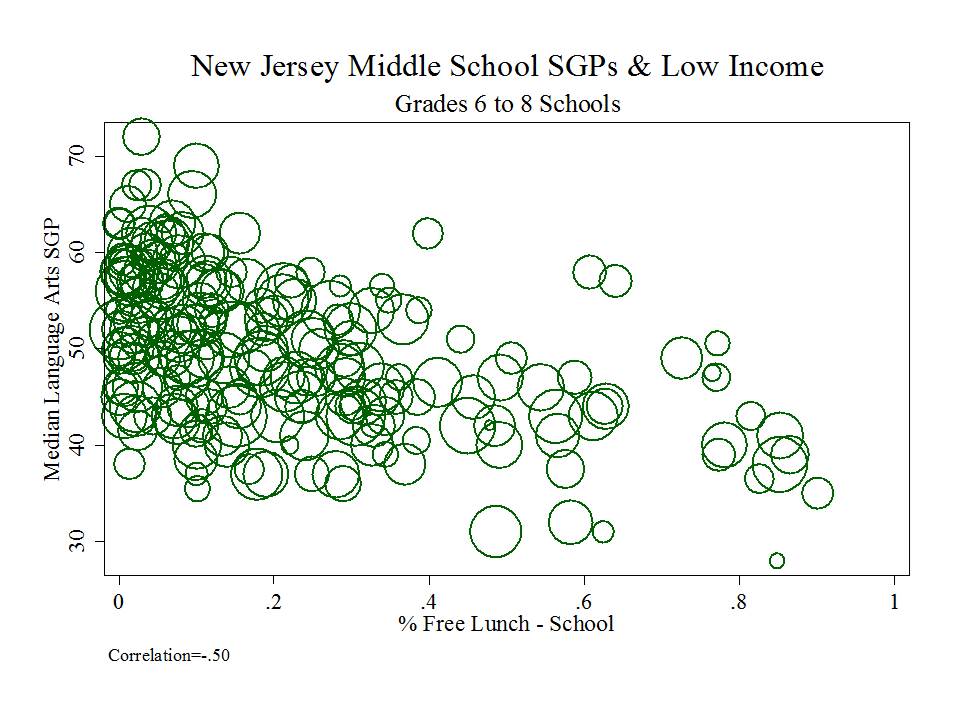
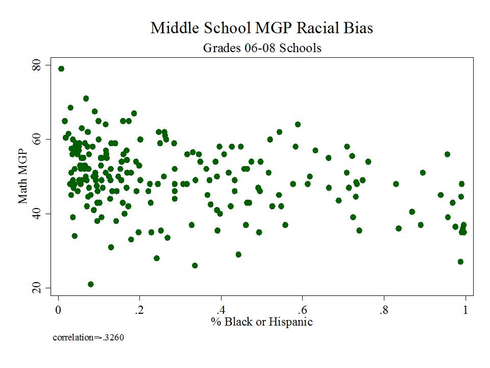
So, this morning I put together four quick graphs of the relationship between school level percent free lunch and median SGPs in language arts and math and school level 7th grade proficiency rates and median SGPs in language arts and math. Just how bad is the bias in the New Jersey SGP/MGP data? Well, here it is! (actually, it was bad enough to shock me)
First, if you are a middle school with higher percent free lunch, you are, on average likely to have a lower growth percentile rating in Math. Notably, the math ASK assessment has significant ceiling effect leading into middle grades, perhaps weakening this relationship. (more on this at a later point)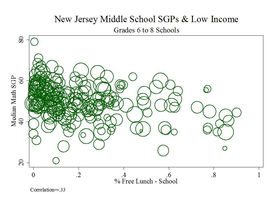
If your are a middle school with higher percent free lunch, you are, on average, likely to have a lower growth percentile rating in English Language Arts. This relationship is actually even more biased than the math relationship (uncommon for this type of analysis), likely because the ELA assessment suffers less ceiling effect problem.
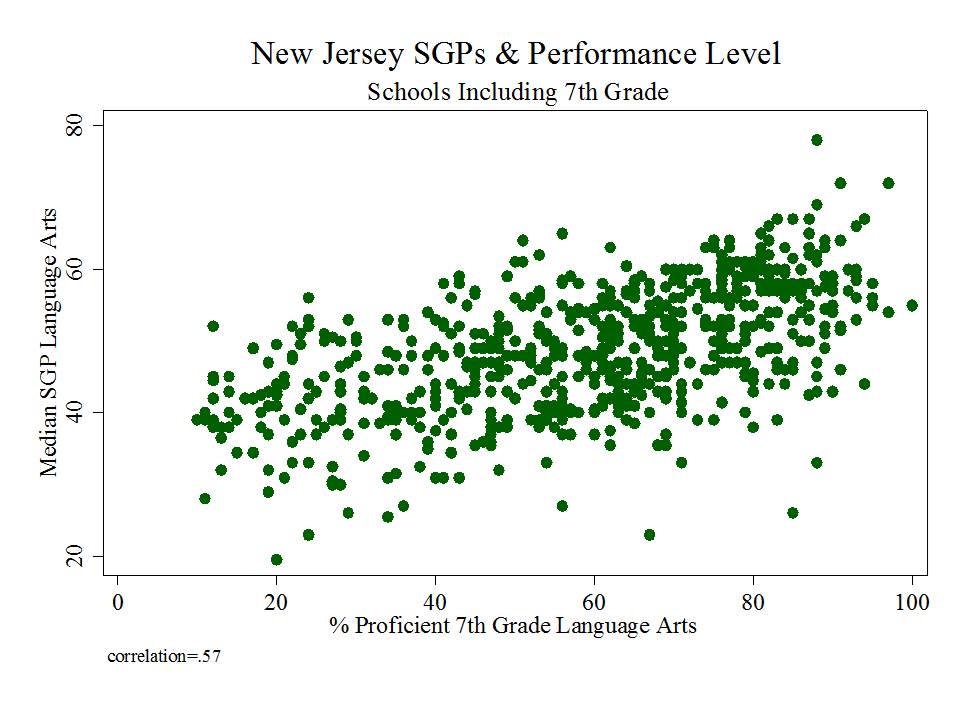
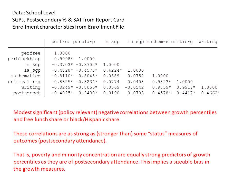
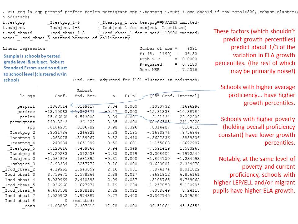
 As with many if not most SGP data, the relationship is actually even worse when we look at the correlation with average performance level of the school, or peer group. If your school has higher proficiency rates to begin with, your school will quite likely have a higher growth percentile ranking:

The same applies for English Language Arts:
Quite honestly these the worst – most biased – school level growth data I think I’ve ever seen.
They are worse than New York State.
They are much worse than New York City.
And they are worse than Ohio.
And this is just a first cut at them. I suspect that if I have actual initial scores or even school level scale scores, the relationship between those scores and growth percentile is even stronger. But will test that when opportunity presents itself.
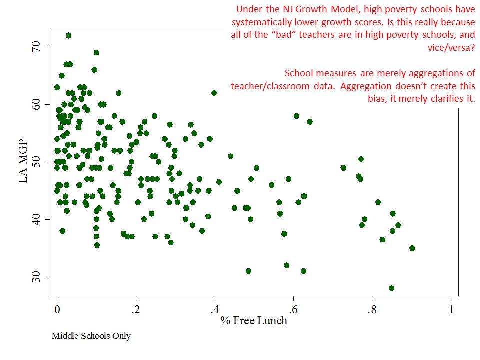
Further, because the bias is so strong at the school level – it is likely also quite strong at the teacher level.
New Jersey’s school level MGPs are highly unlikely to be providing any meaningful indicator of the actual effectiveness of teachers, administrators and practices of New Jersey schools. Rather, by conscious choice to ignore contextual factors of schooling (be it the vast variations in the daily lives of individual children, or the difficult to measure power of peer group context, and various other social contextual factors), New Jersey’s growth percentile measures fail miserably.
No school can be credibly rated as effective or not based on these data, nor can any individual teacher be cast as necessarily effective or ineffective.
And this not at all unexpected.
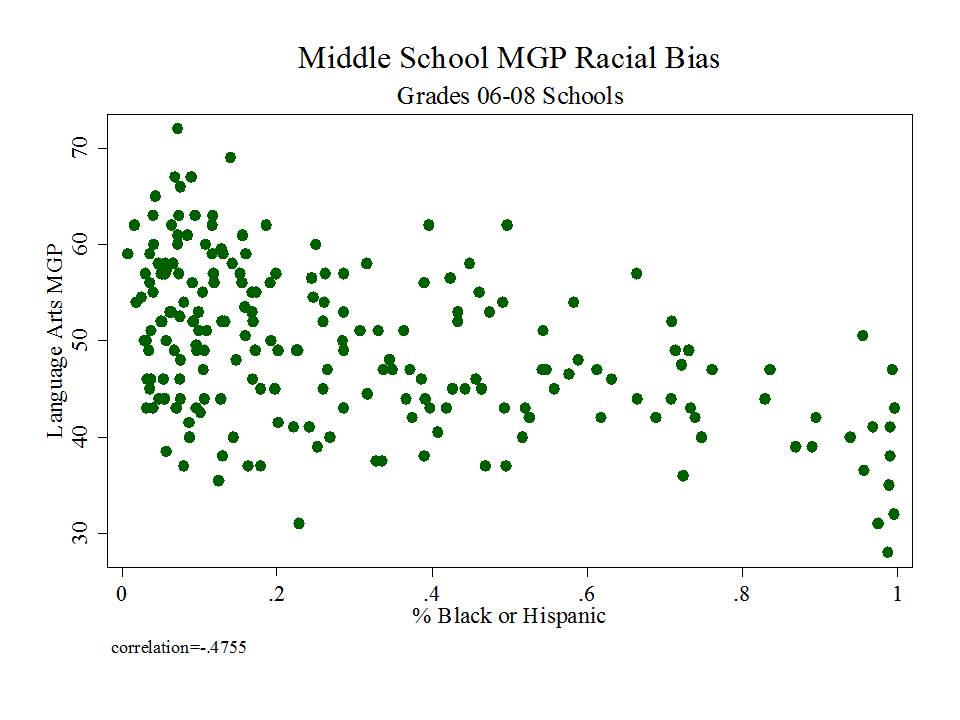
Additional Graphs: Racial Bias
Just for fun, here’s a multiple regression model which yields additional factors that are statistically associated with school level MGPs. First and foremost, these factors explain over 1/3 of the variation in Language Arts MGPs. That is, Language Arts MGPs seem heavily contingent upon a) student demographics, b) location and c) grade range of school. In other words, if we start using these data as a basis for de-tenuring teachers, we will likely be detenuring teachers quite unevenly with respect to a) student demographics, b) location and c) grade range… despite having little evidence that we are actually validly capturing teacher effectiveness – and substantial implication here that we are, in fact, NOT.
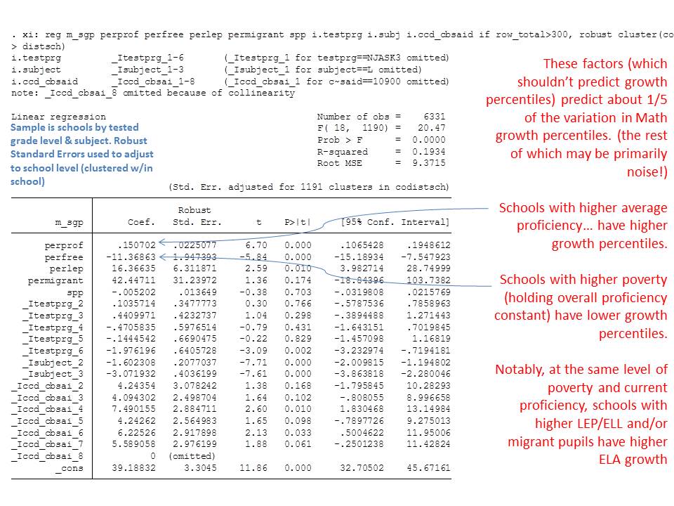
Patterns for math aren’t much different. Less variance is explained, again, I suspect because of the strong ceiling effect on math assessments in the upper elementary/middle grades. There appears to be a charter school positive effect in this regression, but I remain too suspicious of attaching any meaningful conclusions to these data. Besides, if we assert this charter effect to be true as a function of these MGPs being somehow valid, then we’d have to accept that charters like Robert Treat in Newark are doing a particularly poor job (very low MGP either compared to similar demographic schools, or similar average performance level schools).
School Level Regression of Predictors of Variation in MGPs
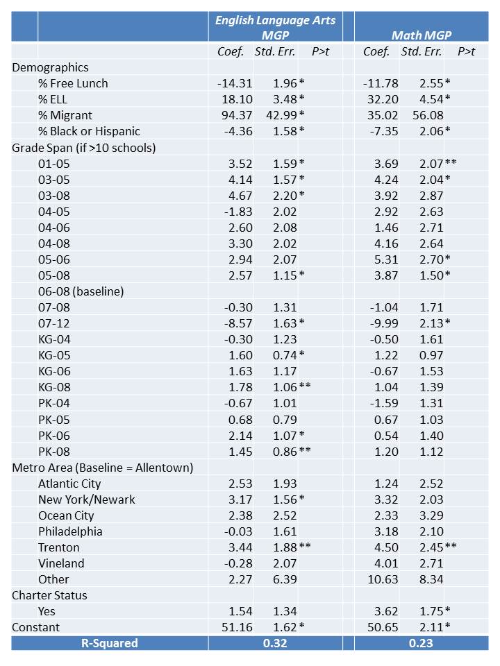
*p<.05, **p<.10
At this point, I think it’s reasonable to request that the NJDOE turn over masked (removing student identifiers) versions of their data… the student level SGP data (with all relevant demographic indicators), matched to teachers, attached to school IDs, and also including certifying institutions of each teacher. These data require thorough vetting at this point as it would certainly appear that they are suspect as a school evaluation tool. Further, any bias that becomes apparent to this degree at the school level – which is merely an aggregation of teacher/classroom level data – indicates that these same problems exist in the teacher level data. Given the employment consequences here, it is imperative that NJDOE make these data available for independent review.
Until these data are fully disclosed (not just their own analyses of them, which I expect to be cooked up any day now), NJDOE and the Board of Education should immediately cease moving forward on using these data either for any consequential decisions either for schools or individual teachers. And if they do not, school administrators, local boards of education and individual teachers and teacher preparation institutions (which are also to be rated by this shoddy information) should JUST SAY NO!
A few more supplemental analyses

Bravo! I look forward to the encore & can hear the winces from NJ already.
I’m curious: how can you, with just the simple bivariate scatterplots, unequivocally attribute this to “bias” as opposed to “there are, on average, better teachers in the schools that, on average, perform better on state assessments”? Put another way: it seems as though for this to be solely attributable to bias, you would have to assume that quality teachers are randomly distributed across schools, I think.
Ed Fuller, who has done a lot of solid empirical work and comments regularly here, found that, particularly in Texas (and in Austin) students’ access to high quality teachers is not random, although one can certainly quibble with how he operationalizes teacher quality.
The point is that we cannot possibly sort out that which is bias here, and that which is teacher effect variation. To go a step further, we also can’t sort out that portion which is simply noise, but for the fact that at least the noise portion would not be patterned, as we see above.
However, we do generally find that these patterns are not as clear as this in models that actually include student and classroom level covariates. That is, in more thorough value added models, when we run these kinds of statistical checks, the remaining patterns are far noisier.. and less patterned/systematic. The New York City data provide one example. The patterns of potential bias are hardly visible, but some can be teased out with multivariate regressions. That said, lack of visible patterns may simple mean that there exist counterbalancing clusters of bias within. That’s actually going on here with the math assessment, where ceiling effect between grades 4 and 6 (at least) is muting MGPs for very low poverty, high performing districts.
So… the point is that these scatterplots… especially with respect to average performance status… are so strongly, suspiciously patterned, that the pattern is likely primarily a function of bias, and not a function of uneven distribution of teaching talent. Better models (with covariates), applied to better assessment data, rarely yield a pattern this clear.
In other words, experience with this type of data… certainly suggests that a large portion of the variance we see above is, in fact, bias… and likely much more so than is a function of systematic sorting of true teacher quality.
Valuable! Thank you!