Friday Story Time: Deconstructing the Cycle of Reformy Awesomeness

Once upon a time, there was this totally awesome charter school in Newark, NJ. It was a charter school so awesome that its leaders and founders and all of their close friends decided they must share their miracle with the world in books on the reasons for their awesomeness, including being driven by data and teaching like a champion!

The school’s break-the-mold – beating the odds – disruptively innovative awesomeness was particularly important during this critical time of utter collapse of the American education system which had undoubtedly been caused by corrupt self-interested public school teachers (& their unions) who had been uniformly ill-trained by antiquated colleges and universities that themselves were corrupt and self-interested and generally in the business of selling worthless graduate degrees.

In fact, the undisputed awesomeness of this North Star Academy could, in theory, provide the foundation for a whole new approach to turning around the dreadful state of American education.

And thus came the Cycle of Reformy Awesomeness, which looks something like this:

Slide1

Built on the foundation of awesomeness established by THE North Star Academy, since teachers are the undisputed most important in school factor determining student outcomes, the awesomeness of North Star could be attributed primarily to the quality of the teachers and innovative practices they used in their data driven classrooms!

Thus, by extension, we must establish new institutions of teacher preparation whereby these truly exceptional teachers (of 3 to 5 years experience) not only are provided the opportunity to share their expertise on a personal collaborative level with their own colleagues, but rather, we should let these teachers be the instructors in a new graduate school of education (regardless of academic qualifications) and we should actually let them grant graduate degrees in education to their own colleagues.

This new approach of letting teachers in a school grant graduate degrees to their own work colleagues (and those in other network schools) could lead to rapid diffusion of excellence and would most certainly negate the corrupt perverse incentives pervasive throughout the current, adult oriented self-interested American higher education system! Disruptive innovation indeed!

And so their founders and disciples took their show on the road. They took their show to state departments of education to urge fast-tracked uncritical promotion of their cycle of awesomeness. They gained leverage on local boards of education in nearby school districts to promote diffusion of their awesomeness. And they set out to other state departments of education to share their insights on how to achieve awesomeness with drive by data… excuse me… being driven by data!

And driven by data they were… for example… absolutely all of the kids in their school passed that test in high school.

And there was much rejoicing.

Slide2And that one too:

Slide3


And there was much rejoicing.

And they were only getting better, and better and better:

Slide4

And there was much rejoicing.

And better:

Slide5The more they looked at their own data – well, really only one measure of their data – the more they patted themselves on the back, congratulated their own reformy awesomeness and shared it with the world. And the state!

Slide6

And there was much rejoicing.

Yup… 100% graduation rate… which is totally unheard of for a high poverty, urban high school in dreadful Newark, NJ! [or at least for a school that happens to be located in the high poverty city of Newark].

A true miracle it was… is… and shall be. One that must be proliferated and shared widely.

But alas, the more they shared, the more they touted their awesomeness, the more it started to become apparent that all might not be quite so rosy in North Star land.

As it turned out, those kids in North Star really didn’t look so much like those others they were apparently so handily blowing out on state tests….

Slide11

And there was complete freakin’ silence!

Somehow, this rapidly growing miracle school was managing to serve far fewer poor children than others (except a few other charter schools also claiming miracle status) around them.

And, they were serving hardly any children with disabilities and few or none with more severe disabilities.

Slide12

And again there was complete freakin’ silence!

And if that was the case, was it really reasonable to attribute their awesomeness to the awesomeness of their own teachers – their innovative strategies… and the nuanced, deep understanding of being driven by data?

Actually, it is perhaps most befuddling if not outright damning that such non-trivial data could be so persistently ignored in a school that is so driven by data?

And there was complete freakin’ silence!

But alas, these were mere minor signals that all might not be as awesome as originally assumed.

It also turned out that of all the 5th graders who entered the halls of awesomeness, only about half ever made it to senior year – year after year after year after year… after year.

Slide14

And for black boys in the school, far fewer than that:

Slide15

And there was complete freakin’ silence!

And in any given year, children were being suspended from the school at an alarming rate.

Slide13

Again… raising the question of how a school driven by data could rely so heavily on a single metric – test scores and pass rates derived from them – to proclaim their awesomeness, when in fact, things were looking somewhat less than awesome.

Could a school really be awesome  if only the fewer than half who remain (or 20% of black boys who remain) pass the test? Might it matter at least equally as much what happened to the the other half who left?

Was it perhaps possible that the “no excuses” strategies endorsed as best practices both in their school and in their training of each other really weren’t working so well…and weren’t the strategies of true teaching champions… but rather created a hostile and oppressive environment causing their high attrition rate? Well… one really can say this one way or the other…

Regardless of the cause, what possibly could such a school share with those traditional supposedly failing public schools who lacked similar ability to send the majority of their children packing? Further, what possibly could the rather novice teachers in this school charged with granting their own co-workers graduate credentials share with experienced researchers and university faculty training the larger public school teacher workforce?

Alas the miracle was (is) crumbling.

But that miracle wasn’t just any ol’ miracle. Rather, it was the entire foundation for the reformy cycle of awesomeness! And without that foundation, the entire cycle comes crumbling down.

Slide16

No miraculously awesome charter school [in fact, one might argue that any school with such attrition is an unqualified failure].

Thus no valid claim of miraculous teachers and teaching.

Thus no new secret sauce for teacher preparation.

All perpetrated with deceptive and in some cases downright fraudulent (100% graduation rate?) presentation of data.

And thus the search continues… for the next miracle… and the next great disruptive innovation to base on that miracle… whatever… wherever it may be.


Pauvre, Pauvre NYC Charter Schools?

There’s nothing really new in this post. I’m just revisiting data and figures that I’ve addressed over and over in this blog – drawn from this report and this conference paper. I’m reposting this information because many seem to quickly forget or totally ignore what we already know and the current debate over whether the city of New York should charge charter schools rent is clouded by the usual mix of non-information, lack of information, disinformation and catchy (though false) statements on t-shirts.

These data are from 2008-2010 and at some point I will update these analyses. But, while downloading, parsing and analyzing NYC district school data is relatively straightforward, it  remains a more burdensome task to get a complete picture of charter school financing in NYC and most other locations for that matter (searching through non-profit filings, etc.). That, in and of itself, raises serious accountability concerns [see the extent of footnotes needed in the above report to clarify our various concerns over clarity, completeness, accuracy and precision of charter school financial reporting].

Another important note is that conditions in district schools in New York City have continued to decline… with larger and larger class sizes each year… and persistent underfunding of the state school finance system. Thus, it is quite possible that the class size and other advantages charters held over district schools between 2008 and 2010 are much greater now.

So, what do we know about NYC charter schools? [and to be clear, this is an NYC specific issue… which, if you read the above report and paper… plays out differently, for example, in Ohio and Texas]

First, NYC charter schools have historically served much less needy student populations than their same grade level district school counterparts in the same borough of the city:

Slide1

Second, New York City charter schools in many cases spend far more on a per pupil basis than do district schools serving similar student populations, at the same grade level in the same borough.

Slide2

Third, Class Sizes at the elementary and middle school level tend, on average to be smaller, and in many cases much smaller (5 to 10 students per class smaller) in charter schools than in district schools.

Slide3

Fourth, even with these resource advantages, New York City charter schools show very mixed performance outcomes compared to same grade level district schools serving similar student populations in the same borough.

Slide4

My intent here is not to argue whether the city should or should not charge $2,700 per pupil rent to charters. Clearly, the effect of such a policy would fall disparately across charter school operators – where some are far more advantaged than others.  It is important that we not simply accept the rhetoric of the pauvre, pauvre charter school that faces such awful mistreatment under possible city policy changes.

The big issue here – the overarching issue – regards the extent of inequities in access to resources that persist across the city system. Inequities exist across district schools by neighborhood and students served.

An important finding in the figures above is that huge inequities persist within the charter sector – a sector that has been selectively advantaged by the current administration’s policies over the past decade.

Whoever becomes the next Mayor of NYC must consider how the whole system fits together and how that system can generate the best distribution of opportunities for all children.

Equity is a necessary concern and one that is not resolved by providing, endorsing or expanding choices among inequitable alternatives.

Maps of NYC Charter and District School % Free Lunch 2010-11 (NCES Common Core of Data)

Mapping NYC Charter Schools

harlem charters

Bronx ChartersBkln charters

Revisiting the Complexities of Charter Funding Comparisons

This Education Week Post today rather uncritically summarized a recently published article based on an earlier report on charter school spending “gaps.” I’ve not had a chance to dig into this updated study yet, but the Ed Week post also referred to an earlier study from Ball State University which I have critiqued on multiple occasions. Importantly, my previous critiques of this study point to the complexities of making these comparisons appropriately.  Here is one version of my critique of the Ball State study, which appears in Footnote 22, page 49 of this study: http://nepc.colorado.edu/files/rb-charterspending_0.pdf

A study frequently cited by charter advocates, authored by researchers from Ball State University and Public Impact, compared the charter versus traditional public school funding deficits across states, rating states by the extent that they under-subsidize charter schools. The authors identify no state or city where charter schools are fully, equitably funded.

But simple direct comparisons between subsidies for charter schools and public districts can be misleading because public districts may still retain some responsibility for expenditures associated with charters that fall within their district boundaries or that serve students from their district. For example, under many state charter laws, host districts or sending districts retain responsibility for providing transportation services, subsidizing food services, or providing funding for special education services. Revenues provided to host districts to provide these services may show up on host district financial reports, and if the service is financed directly by the host district, the expenditure will also be incurred by the host, not the charter, even though the services are received by charter students.

Drawing simple direct comparisons thus can result in a compounded error: Host districts are credited with an expense on children attending charter schools, but children attending charter schools are not credited to the district enrollment. In a per-pupil spending calculation for the host districts, this may lead to inflating the numerator (district expenditures) while deflating the denominator (pupils served), thus significantly inflating the district’s per pupil spending. Concurrently, the charter expenditure is deflated.
Correct budgeting would reverse those two entries, essentially subtracting the expense from the budget calculated for the district, while adding the in-kind funding to the charter school calculation. Further, in districts like New York City, the city Department of Education incurs the expense for providing facilities to several charters. That is, the City’s budget, not the charter budgets, incur another expense that serves only charter students. The Ball State/Public Impact study errs egregiously on all fronts, assuming in each and every case that the revenue reported by charter schools versus traditional public schools provides the same range of services and provides those services exclusively for the students in that sector (district or charter).

Charter advocates often argue that charters are most disadvantaged in financial comparisons because charters must often incur from their annual operating expenses, the expenses associated with leasing facilities space. Indeed it is true that charters are not afforded the ability to levy taxes to carry public debt to finance construction of facilities. But it is incorrect to assume when comparing expenditures that for traditional public schools, facilities are already paid for and have no associated costs, while charter schools must bear the burden of leasing at market rates – essentially and “all versus nothing” comparison. First, public districts do have ongoing maintenance and operations costs of facilities as well as payments on debt incurred for capital investment, including new construction and renovation. Second, charter schools finance their facilities by a variety of mechanisms, with many in New York City operating in space provided by the city, many charters nationwide operating in space fully financed with private philanthropy, and many holding lease agreements for privately or publicly owned facilities.

New York City is not alone it its choice to provide full facilities support for some charter school operators (http://www.thenotebook.org/blog/124517/district-cant-say-how-many-millions-its-spending-renaissance-charters). Thus, the common characterization that charter schools front 100% of facilities costs from operating budgets, with no public subsidy, and traditional public school facilities are “free” of any costs, is wrong in nearly every case, and in some cases there exists no facilities cost disadvantage whatsoever for charter operators.

Baker and Ferris (2011) point out that while the Ball State/Public Impact Study claims that charter schools in New York State are severely underfunded, the New York City Independent Budget Office (IBO), in more refined analysis focusing only on New York City charters (the majority of charters in the State), points out that charter schools housed within Board of Education facilities are comparably subsidized when compared with traditional public schools (2008-09). In revised analyses, the IBO found that co-located charters (in 2009-10) actually received more than city public schools, while charters housed in private space continued to receive less (after discounting occupancy costs). That is, the funding picture around facilities is more nuanced that is often suggested.

Batdorff, M., Maloney, L., May, J., Doyle, D., & Hassel, B. (2010). Charter School Funding: Inequity Persists. Muncie, IN: Ball State University.

NYC Independent Budget Office (2010, February). Comparing the Level of Public Support: Charter Schools versus Traditional Public Schools. New York: Author, 1.

NYC Independent Budget Office (2011). Charter Schools Housed in the City’s School Buildings get More Public Funding per Student than Traditional Public Schools. New York: Author. Retrieved April 24, 2012, from http://ibo.nyc.ny.us/cgi-park/?p=272.

NYC Independent Budget Office (2011). Comparison of Funding Traditional Schools vs. Charter Schools: Supplement. New York: Author .Retrieved April 24, 2012, from http://www.ibo.nyc.ny.us/iboreports/chartersupplement.pdf.

Note: The average “capital outlay” expenditure of public school districts in 2008-09 was over $2,000 per pupil in New York State, nearly $2,000 per pupil in Texas and about $1,400 per pupil in Ohio. Based on enrollment weighted averages generated from the U.S. Census Bureau’s Fiscal Survey of Local Governments, Elementary and Secondary School Finances 2008-09 (variable tcapout): http://www2.census.gov/govs/school/elsec09t.xls

The Non-reformy Lessons of KIPP

We’ve all now had a few days to digest the findings of the most recent KIPP middle school mega-study. I actually do have some quibbles with the analyses themselves and the presentation of them, one of which I’ll address below, but others I’ll set aside for now.  It is the big picture lessons that are perhaps most interesting.

I begin this post with a general acceptance that this study, like previous KIPP studies, and like studies of charter effectiveness in markets generally characterized by modest charter market share and dominance of high flying charter chains, typically find that the kids attending these charters achieve marginal gains in math, and sometimes reading as well (as in the new KIPP study). These findings hold whether applying a student matching analysis or lottery based analysis (though neither accounts for differences in peer group).

In the past few years, we’ve heard lots of talk about no excusesness and its (supposed) costless (revenue neutral) effectiveness and potential to replace entire urban school systems as we know them (all the while reducing dramatically the public expense).  But the reality is that what underlies the KIPP model, and that of many other “high flying” no excuses charter organizations, are a mix of substantial resources, leveraged in higher salaries, additional time – lots of additional time (and time is money) and reasonable class sizes, coupled with a dose of old-fashioned sit-down-and-shut up classroom/behavior management and a truckload of standardized testing. Nothin’ too sexy there. Nothin’ that reformy. Nothin’ particularly creative.

The brilliant Matt Di     Carlo of Shanker Blog shared with me this quote in e-mail exchanges about the study yesterday:

In other words, the teacher-focused, market-based philosophy that dominates our public debate is not very well represented in the “no excuses” model, even though the latter is frequently held up as evidence supporting the former. Now, it’s certainly true that policies are most effective when you have good people implementing them, and that the impact of teachers and administrators permeates every facet of schools’ operation and culture. Nonetheless, most of the components that comprise the “no excuses” model in its actual policy manifestation are less focused on “doing things better” than on doing them more. They’re about more time in school, more instructional staff, more money and more testing. I’ve called this a “blunt force” approach to education, and that’s really what it is. It’s not particularly innovative, and it’s certainly not cheap.

Expanding on Matt’s final comment here, our report last summer on charter schools found specifically that the costs of scaling up the KIPP model, for example, across all New York City or Houston middle schools would be quite substantial:

Extrapolating our findings, to apply KIPP middle school marginal expenses across all New York City middle school students would require an additional $688 million ($4,300 per pupil x 160,000 pupils). In Houston, where the middle school margin is closer to $2,000 per pupil and where there are 36,000 middle schoolers, the additional expense would be $72 million. It makes sense, for example, that if one expects to find comparable quality teachers and other school staff to a) take on additional responsibilities and b) work additional hours (more school weeks per year), then higher wages might be required. We provide some evidence that this is the case in Houston in Appendix D. Further, even if we were able to recruit an energetic group of inexperienced teachers to pilot these strategies in one or a handful of schools, with only small compensating differentials, scaling up the model, recruiting and retaining sufficient numbers of high quality teachers might require more substantial and sustained salary increases.

But, it’s also quite possible that $688 million in New York or $72 million in Houston might prove equally or even more effective at improving middle school outcomes if used in other ways (for example, to reduce class size). Thus far, we simply don’t know.

Baker, B.D., Libby, K., & Wiley, K. (2012). Spending by the Major Charter Management Organizations: Comparing charter school and local public district financial resources in New York, Ohio, and Texas. Boulder, CO: National Education Policy Center. Retrieved [date] from http://nepc.colorado.edu/publication/spending-major-charter.

Here’s a link to my rebuttal to the rather disturbing KIPP response to our report.

In a recent paper, I continue my explorations of the resource (and demographic) differences of charter schools and their urban contexts. In particular, I’ve been trying to get beyond just looking at aggregate per pupil spending and instead, digging into differences in tangible classroom resources. Here are some related findings of my current paper co-authored with Ken Libby and Katy Wiley.

Baker.Libby.Wiley.Charters&WSF.FEB2013

Finances

Table 5 shows the regression results comparing the site based spending per pupil of charters by affiliation, with New York City district schools serving similar populations, the same grade levels and in the same borough. When comparing by % free or reduced lunch, where KIPP schools are more similar to their surroundings, KIPP schools spent about $4,800 more per pupil. When comparing by % free lunch alone, where KIPPs have lower rates than many surrounding schools, KIPP schools spent more than $5,000 more per pupil.

Slide10

Table 6 shows similar analysis for the Houston Texas area, including schools in surrounding districts which overlap Houston City limits. Splitting KIPPs by those that serve elementary grades (Iower) versus those serving middle (and some upper) grades, This table shows that KIPPs serving lower grades spent marginally less than district schools. KIPPs serving middle/upper grades spent over $3,000 per pupil more.

Slide11

Specific Resource Inputs

This figure shows the relative salaries of teachers, both on an annual basis and equated for months on contract in New York City. KIPP teachers at same degree and experience level were paid about $4,000 more than district teachers. Equating contract months KIPP teachers were paid about the same as district teachers. But the central point here is that KIPP teachers were paid more for the additional time. That said, it would appear that teachers in some other NYC charters were paid even more than KIPPs at same degree and experience level.

Figure 1. Relative Salaries in New York City

Slide12

Here’s a plot of teacher salaries by experience level in Houston Texas. KIPP teachers across the range of experience receive a substantial salary premium for their time and effort.

Slide13

Figure 2. Relative Salaries in Houston

As I’ve said before. This simply makes sense. This is not a critique. These graphs are constructed with publicly available data – the New York State Personnel Master File and the Texas equivalent. I would argue that what KIPP schools are doing here is simple and logical. They are providing more time to get kids further along and they are acknowledging through their compensation systems that if you want to get sufficient quality teachers to provide that additional time, you’re going to have to pay a decent wage.

Finally, here’s a plot of the relative class sizes in New York City, also constructed by regression analysis accounting for location and grade range.

Figure 3. Relative Class Sizes in New York City

Slide14

An “are you kidding me?” moment

There was one point in reading the KIPP report that my head almost exploded. This was where the authors of the report included a ridiculously shoddy analysis in order to brush off claims of cream-skimming. In figure ES.1 of the report, the authors make the argument that it is clear that KIPP schools are not cream-skimming more desirable students by comparing KIPP student characteristics to those of all students in the schools from whence the KIPP students came.  

Figure ES.1. The Non-Proof of Non-Creamskimming

Slide4

The authors are drawing this bold conclusion while relying on but a handful of extremely crude dichotomous characteristics of students.  They are assuming that any student who falls below the 185% income threshold for poverty is equally poor (whether in Arkansas or New York). But many of my prior analyses have shown that even if we take this dichotomous variable and make it, say, trichotomous, we may find that poorer kids (<130% income threshold) are less likely to sort into charter schools (more below).  It is equally if not even more problematic to use a single dummy variable for disability status – thus equating the charter enrolled child with speech impairment to the district enrolled child with traumatic brain injury. The same is likely true of gradients of language proficiency.

The problems of the crudeness of classification are exacerbated when you then average them across vastly disparate contexts.   IT WOULD BE ONE THING if the authors actually threw some caveats about data quality and available and moderated their conclusions on this basis. But the authors here choose to use this ridiculous graph as the basis for asserting boldly that the graph provides PROOF that cream-skimming is not an issue.

Look, we are all often stuck with these less than ideal measures and must make the best of them. This example does not, by any stretch make the best of these inadequate measures. In fact, it makes them even worse (largely through their aggregation across disparate contexts)!

An Alternative look at Houston and New York

I don’t have the data access that Mathematica had for conducting their study. But I have, over time, compiled a pretty rich data set on finances of charter schools in New York and Texas from 2008 to 2010 and additional information on teacher compensation and other school characteristics. Notably, I’ve not compiled data on all of the KIPP charters in California, or all of the KIPP charters in Arkansas, Oklahoma, Tennessee or elsewhere. I’ve focused my efforts on specific policy contexts.  I’ve done that, well, because… context matters. Further, I’ve taken the approaches I have in order to gain insights into basic resource differences across schools, within specific contexts.

The following two tables are intended to make a different comparison than the KIPP creamskimming analysis. They are intended to compare KIPP, and other charter schools in these city contexts with the other schools serving same grade level students. That is, they are intended to compare the resulting peer context, not the sending/receiving pattern. It’s a substantively different question, but one that is equally if not far more relevant. I use regression models to tease out differences by grade range and within New York City, by location.

Table 3 shows that KIPP schools have relatively similar combined free/reduced lunch shares to other same grade schools in New York City (in the same borough). But, Table 3 also shows that KIPP schools have substantively lower % free lunch share (13% lower on average, but with individual schools varying widely). Table 3 also shows that KIPP schools have substantively lower ELL (11% fewer) and special education (3% fewer) populations in New York City.

Slide8

Table 4 shows the results for the Houston area, and this is why context is important to consider. While I would argue that New York City KIPPs do show substantial evidence of income related cream-skimming as well as ELL and special education, I can’t say the same across the board in Houston. Then again, I don’t have the free/reduced breakout in Houston. In Houston, the KIPPs do have lower total special education (and I’m unable to parse by disability type – which is likely important). KIPP middle schools in Houston appear to have higher free/reduced lunch share than middle schools in/around Houston.

Slide9

Differences between Houston and New York and for that matter every other KIPP context are masked by aggregation across all contexts, yet these differences may be relevant predictors of differences in KIPP success that may exist across these contexts.

Note that Houston and New York are non-trivial shares of the total KIPP sample. Here’s my run of KIPPs by state and by major city, using the NCES Common Core of Data 2010-11.

Slide6

Slide7

What does the New York City Charter School Study from CREDO really tell us?

With the usual fanfare, we were all blessed last week with yet another study seeking to inform us all that charteryness in-and-of-itself is preferential over traditional public schooling – especially in NYC! In yet another template-based pissing match (charter vs. district) design study, the Stanford Center for Research on Educational Outcomes provided us with aggregate comparisons of the estimated academic growth of a two groups of students – one that attended NYC charter schools and one that attended NYC district schools. The students were “matched” on the basis of a relatively crude set of available data.

As I’ve explained previously in discussing the CREDO New Jersey report, the CREDO authors essentially make do with the available data. It’s what they’ve got. They are trying to do the most reasonable quick-and-dirty comparison, and the data available aren’t always as precise as we might wish them to be. But, this is also not to say that supposed Gold Standard “lottery-based” studies are all that. The point is that doing policy research in context is tricky, and requires numerous important caveats about the extent to which stuff is, or even can be truly randomized, or truly matched.

The new CREDO charter study found that children attending charters outpaced their peers in district schools in math (significantly) and somewhat less so in reading (relatively small difference). Their analysis included six years of data through 2010-11 (meaning that the last growth period included would be 2009-10 to 2010-11).

How does a CREDO study work?

Students are matched with a virtual peer, where one attends a district school and another attends a charter school. The NYC CREDO study matches students on the following bases:

  • Grade-level
  • Gender
  • Race/Ethnicity
  • Free or Reduced Price Lunch Status
  • English Language Learner Status
  • Special Education Status
  • Prior test score on state achievement tests

The CREDO study does not match students by:

  • Their level of free vs. reduced priced lunch, which may be consequential to the validity of the match if the students in the district school sample are more likely to be free lunch than reduced lunch and the charter school sample the opposite.
  • The type or severity of disability, which may be similarly consequential if it turns out that the charter students are less likely to have more severe disabilities.

Prior score should partially compensate for these shortcomings. But, I discussed some of the problems that arise from assuming these matches to be adequate in a previous post. Nonetheless, this is still a secondary issue.

Perhaps the biggest issue here is that the CREDO method makes no attempt to separate the composition of the peer group from the features of the school. That is, it may be the case that some portion – even a large portion – of the effectiveness being attributed to charter schools is merely a function of putting together a group of less needy students.

CREDO School Effect = Peer Effect + School Effect

So who cares? Why is this important? As I’ve explained a number of times in this blog, from a policy perspective the “scalable” portion is the “school effect” or the stuff – educational programs/services/teacher characteristics, etc. that lead to differences in student achievement even if all of the kids were the same (not just the observed/matched child). If the effect is largely driven by achieving a selective peer group, that may be equally valuable for children who have access to this school, but one can only stretch the selective peer group model so far in the context of a high poverty city. It’s not scalable. It’s a policy that necessarily requires advantage a few (in terms of peer group) while disadvantaging others.

What about those peer groups?

Here’s a look at the “relative demographics” of New York City charter schools compared to schools serving the same grade ranges in the same borough.  This figure is derived from data used in a previous report, and being used in a forthcoming study, where we go to great lengths to determine a) the comparability of students, b) the characteristics of teachers, programs and services and c) the comparable spending levels of New York City charter schools and district schools serving similar students of similar grade ranges. Our studies have employed data from 2008-2010, significantly overlapping the CREDO study years.

Figure 1. Relative Demographics of Selected Management Organizations 2008-10

Slide3

Here, we see that compared to same grade level schools in the same borough, NYC charters have in many groups, 10% to 20% fewer children qualifying for free lunch (<130% income level for  poverty), even if they appear to have comparable shares qualifying for free or reduced price lunch (<185% income level for poverty). These groups are substantively different in terms of their educational outcomes.

Further, charters serve a much lower share of children with limited English language proficiency, a finding validated by other authors. And charter schools generally serve much lower shares of children with disabilities (a finding we explored in greater detail here!).

So, while CREDO matched individual students by the crude characteristics above, they did not attempt to separate in their analysis, whether actual school quality factors, or these substantive peer group differences, were the cause of differences in student achievement growth.

Now, we have no idea what share of the growth, if any, is explained by peer effect, but we do know from a relatively large body of research that selective peer effects work both to advantage those selected into the desirable peer group and disadvantage those selected out. That aside, it is conceivable that New York City charter schools are doing some things that may lead to differential achievement growth. In fact, given what we now know from our various studies of New York City charter schools (including peer sorting), I’d be quite shocked and perhaps even disappointed if NYC charters were not able to leverage their various advantages to achieve some gain for students!

In New York City, what are those strategies? [School Effects?]

Let’s start with class size variation. We used data from 2008 to 2010 to determine the average difference in class size between NYC charter school sand district schools serving similar grade ranges and similar student populations. Here’s what we found for 8th grade as an example.

Figure 2. Charter Class Size Difference from Similar District School

Slide4

Now, on to teacher salaries. First, we used individual teacher level data to estimate the salary curve by experience for teachers in NYC charter schools and similar assignments in district schools. Here’s what we found. Charter teachers, who already have smaller class sizes on average, are getting paid substantively more in many cases (in particularly elite/recognized charter management chains).

Figure 3. Projected Teacher Salaries (based on regression model of individual teacher data)

Slide8

But, that pay does come with additional responsibilities, which for students translates to a) longer school years and b) greater individual attention. Here are the contract month differences for NYC charter and district school teachers.

Figure 4. Contract Months

Slide9

Figure 5. Salary Controlling for Months

Slide10

Others have noted that “no excuses” models often provide substantial additional time in terms of length of school year and length of school day (+20% to 30% more time), but most have failed to provide reasonable cost analysis of this additional time.  Here are a few pictures of the comparable spending levels of district and charter schools, for elementary and middle schools by special education share (the strongest predictor of differences in site budgets per pupil in NYC.

Figure 6. Spending per Pupil and Special Education for Elementary Schools.

Slide7

Figure 7. Spending per Pupil and Special Education for Middle Schools.

Slide6

In our more comprehensive report on the topic and in a related forthcoming article, we have found that leading charter management organizations often spend from $3,000 to $5,000 more per pupil in NYC than do district schools serving similar populations.

To Summarize

Okay, so we know that:

CREDO School Effect = Peer Effect + School Effect

And we know that the peer groups into which the “matched” kids were sorted are substantively different from one another and that various school resources are substantively different (despite what some very poorly constructed, very selective analyses might suggest).  It’s certainly possible that BOTH MATTER – and that BOTH MATTER quite a lot. Or at least they should.

Figure 8. The Real Question behind the NYC CREDO Study?

NYC CREDO

Actually, it’s rather depressing that all that additional time, paid for in additional salaries and applied to smaller classes of more advantaged kids couldn’t accomplish an even better gain on reading assessments. That would undermine a lot of what we currently understand about schooling and peer effects.

And the Policy Implications Are?

What’s most important here is how we interpret the policy implications. Certainly, given the wide variation in both district and charter schooling in NYC and substantial differences between them, it would be foolish to assert that any differences found in the CREDO study provide endorsement of charter expansion. That is, provide endorsement of simply adding more schools called charter schools. The study is a study of charter schools that serve largely selective populations and have lots of additional resources for doing so. This by no means provides endorsement that we could just add any old charter schools in any neighborhood and achieve similar results.

It also may be the case that even if we try our hardest to replicate only the good charters, that as charter market share increases in NYC, both the more advantaged students and the access to big money philanthropy starts to run thin. Note that the NYC share of children in charter schools remained under/around 4% during the period studied – a sharp contrast from other states/cities where charter performance has been much less stellar.

An alternative assertion that might be drawn from combining the NYC charter study with our previous studies, is that more students might benefit from being provided additional resources. But scaling up these charter alternatives would not be cheap. Here’s what we found in our comparisons of New York City and Houston:

These findings, coupled with evidence from other sources discussed earlier in this report, paint a compelling picture that “no excuses” charter school models like those used in KIPP, Achievement First and Uncommon Schools, including elements such as substantially increased time and small group tutoring, may come at a significant marginal cost. Extrapolating our findings, to apply KIPP middle school marginal expenses across all New York City middle school students would require an additional $688 million ($4,300 per pupil x 160,000 pupils). In Houston, where the middle school margin is closer to $2,000 per pupil and where there are 36,000 middle schoolers, the additional expense would be $72 million. It makes sense, for example, that if one expects to find comparable quality teachers and other school staff to a) take on additional responsibilities and b) work additional hours (more school weeks per year), then higher wages might be required. We provide some evidence that this is the case in Houston in Appendix D. Further, even if we were able to recruit an energetic group of inexperienced teachers to pilot these strategies in one or a handful of schools, with only small compensating differentials, scaling up the model, recruiting and retaining sufficient numbers of high quality teachers might require more substantial and sustained salary increases.

But, it’s also quite possible that $688 million in New York or $72 million in Houston might prove equally or even more effective at improving middle school outcomes if used in other ways (for example, to reduce class size). Thus far, we simply don’t know.

As I noted in a previous post, it’s time to get beyond these charter vs. district school pissing match studies and seek greater precision in our comparisons and deeper understanding of “what works” and what is and isn’t “scalable.”

From Portfolios to Parasites: The Unfortunate Path(ology) of U.S. Charter School Policy

I recall several years ago attending an initial organizing meeting for a special interest group on Charter Schools at the American Educational Research Association. Note to outsiders – AERA has several special interest groups, some research oriented, some advocacy oriented…  many somewhere in between. These are member organized groups and many are very small. If I recall correctly, there were a handful of us at that meeting, including Gary Miron, Katy Bulkley and a few others. If memory serves me, I think Rick Hess may have paid a visit to the meeting to argue that this new group should really just be a part of the school choice special interest group. All of that aside, I and others attended this meeting out of our interest in studying this relatively new concept of charter schools. Most of us were intrigued by the possibilities of alternative governance structures that might provide opportunity for innovation (what might now be referred to a disruptive innovation).

I didn’t spend a whole lot of time researching charters in my first few years after that, but eventually I did start to explore charter schooling and teacher labor markets – specifically the recruitment/retention of teachers based on different academic backgrounds – specifically college selectivity. My perspective was that some creative, energetic leadership (which might now be referred to as Cage-busting leadership) that might be associated with a mission-driven start-up school, coupled with an ounce or two of deregulation, and applied in the right context, might provide opportunities to recruit an academically talented pool of teachers. Our research largely supported these assertions.

  • Baker, B. D., & Dickerson, J. L. (2006). Charter Schools, Teacher Labor Market Deregulation, and Teacher Quality Evidence From the Schools and Staffing Survey. Educational Policy, 20(5), 752-778.

In recent years, however, my perception is that this whole movement has gotten way out of control – it has morphed dramatically – especially the punditry and resultant public policy surrounding charter schooling. Sadly, I’m reaching a point where I now believe that the end result is causing more harm than good.  In my view, many charter schools, and certainly the political movement of charter schooling, are no-longer operating in the public interest. In fact, they have all the incentive in the world to do just the opposite, and there is little or no sign of this turning around any time soon.

We’ve shifted dramatically, and rather quickly from what some might refer to as a portfolio model, to what I would now characterize as a parasitic one.

Overarching Incentives & Chartery Miracles

Since the early phases of significant national charter expansion which coincided (somewhat) with early implementation of NCLB, chartery success has been reduced to a definition reminiscent of the cult of efficiency. Chartery success (accompanied by headlines, news magazine segments and visits from politicians) is largely defined as A) getting higher test scores or greater test score growth, B) for less money, and C) with the “same” kids. Because this is the supposed definition of success, punditry around charter schooling – and research designed to endorse this punditry – makes every effort to validate A, while obfuscating or completely misrepresenting B and/or C.

Figure 1. Chartery Miracle Success Framework

Slide1

The central objective in Chartery Miracle Punditry is to prove that average scores, and otherwise methodologically weak policy analyses show that charter students outperform their traditional public school counterparts.

These studies rarely if ever include any accurate measure of the resources used by charters, more often than not citing bogus, irrelevant studies or providing flimsy back of the napkin analysis.

These studies often use entirely insufficient measures for declaring students as being “matched” with peers between district and charter schools, fail to consider fully the role of peer effects as one of the largest school factors, or the intersection of selective attrition and peer effects.

In part, because it is increasingly well understood that this is the way the game is played, charter school operators have all the incentive in the world to play the game this way (even if they were otherwise predisposed not to). And apparently far too many charter operators are responsive to these incentives.

Competition for Demographic Advantage

This recent Reuters article by Stephanie Simon explains practices actually used by many charter operators, arguably in response to current incentives.

http://www.reuters.com/article/2013/02/15/us-usa-charters-admissions-idUSBRE91E0HF20130215

In short, charter schools are applying a variety of creative strategies to screen out those students they feel won’t help their numbers. In some/many cases, children will be screened out on the basis of otherwise unobservable characteristics. Two low income children wish to apply… but only one is sufficiently motivated to complete the 15 page entry essay. They are labeled as similar as one returns to the district school and one matriculates to the charter, but clearly there is at least some difference between them which may influence their future performance. But these mechanisms also serve to sort out poorer children from more disrupted households, more mobile families, and non-English speaking families. And clearly they send a signal to parents of children with disabilities that this may not be the school for you.

In many parts of the country, especially in areas where charter schools serve a larger share of total enrollment, charter schools do seem to serve more lower income students. And in states where there exists an incentive to serve children with disabilities, charters often do so (boutique special education charters). But these incentives get out of hand as well.

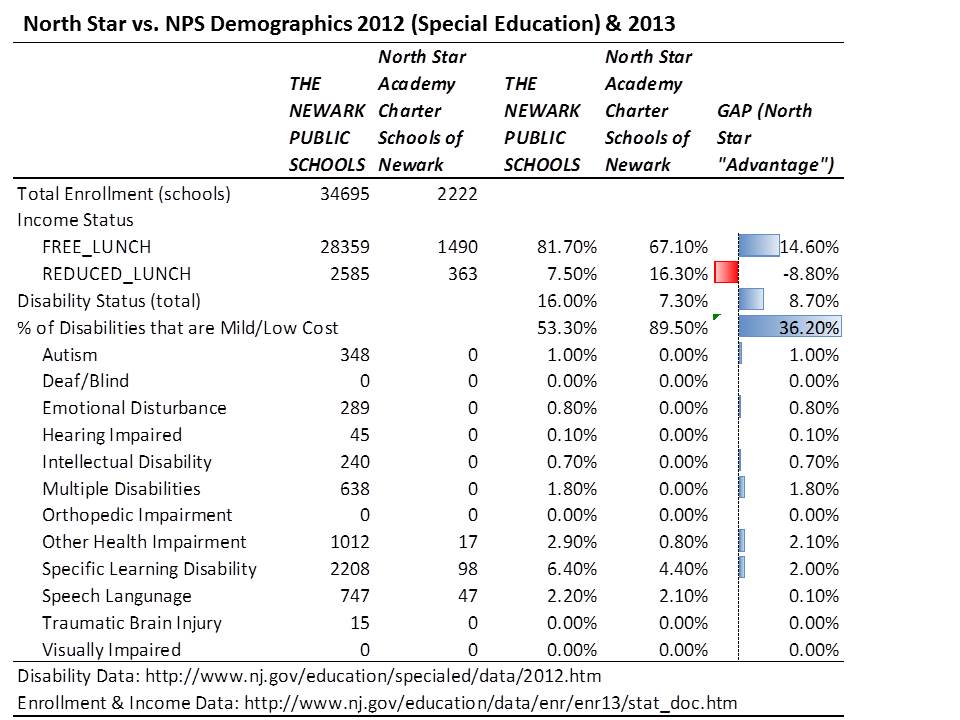
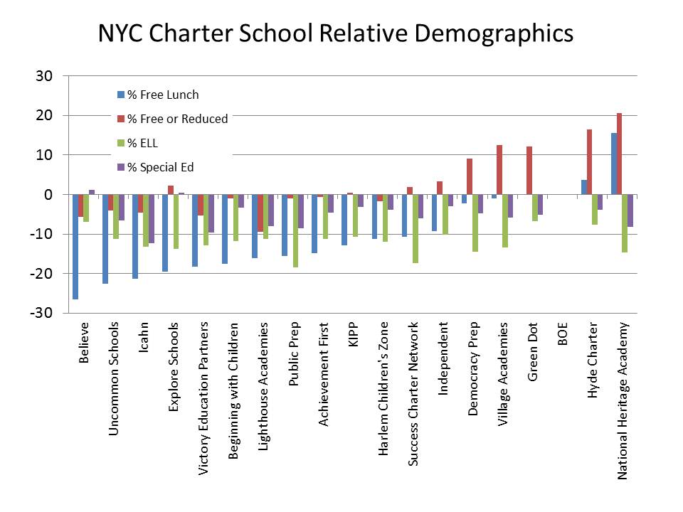
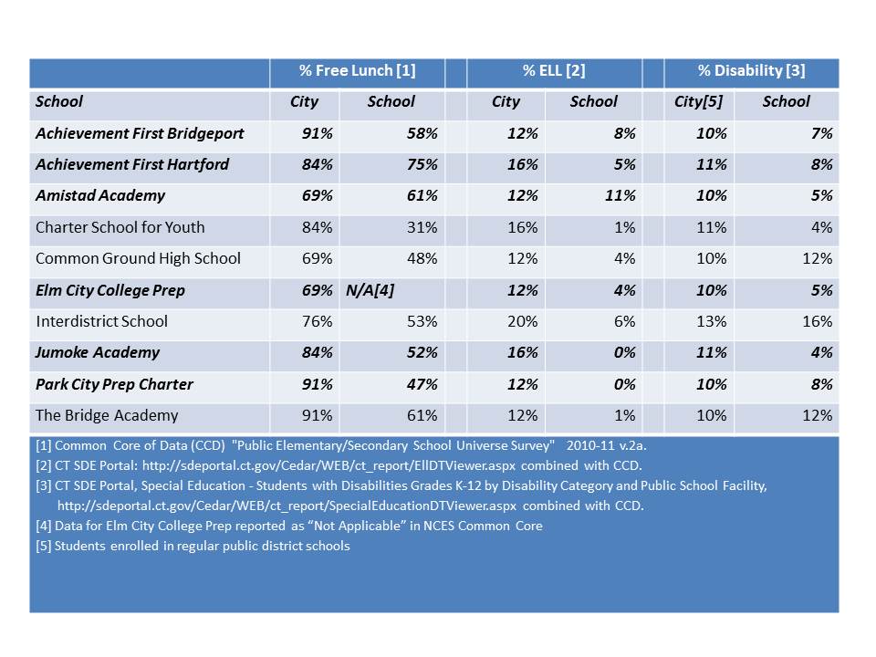
In affluent, economically diverse states like New Jersey, New York and Connecticut, as I commented in the Reuters article, my research (& related posts) shows substantial cream-skimming among charters.  Many of these findings are validated by others, as I explain in my reports/publications.  Here are a few figures on demographics of New York and Connecticut charter schools.

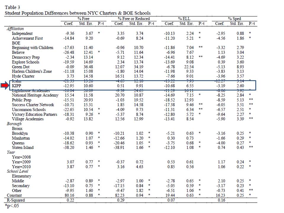
This figure on New York City Charter schools draws on data from a forthcoming article (related to a recent report). In this analysis, I use three years of data from 2008-10, and I estimate a regression equation for each demographic measure, comparing schools that serve the same grade level in the same borough of the city. The graph shows how much lower (or higher) the population share is in each charter school chain, relative to NYC district schools.

Figure 2. New York City Relative Demographics

Slide2

This next figure shows the demographics of Connecticut Charter Schools that are in high poverty cities. To construct this comparison, I combine CTDOE data with data from NCES Common Core. I sum the total number of public & charter school enrolled children by City (school location in CCD) and the total numbers of free lunch, ELL and special education enrolled children. Note that the special education concentrations are for only regular district (& charter) schools. Overall district rates of children with disabilities are marginally higher (because some are in special &/or private placements).

Table 1. Connecticut Charter Schools in High Poverty (<50% Free Lunch) Cities

Slide8

Let me make this absolutely clear. In a heterogeneous urban schooling environment, the more individual schools or groups of schools engage in behavior that cream skims off children who are less poor, less likely to face language barriers, far less likely to have a disability to begin with, and unlikely at all to have a severe disability, the higher the concentration of these children left behind in district schools.(see for example: https://schoolfinance101.wordpress.com/2012/08/06/effects-of-charter-enrollment-on-newark-district-enrollment/)

Indeed, as I’ve pointed out previously, districts create some similar (or even more extreme) segregation on their own through magnet schools, but under these circumstances, districts can (and should) regulate the extent of segregation – and specifically the extent to which high need children are left behind clustered in certain district schools. Certainly some urban districts do a very poor job at managing this balance.

But with independent charter expansion, districts lose the ability to even try to manage the balance. Sadly, what may initially have been conceived of as a symbiotic relationship between charter and district schools is increasingly becoming parasitic!

In a “competitive marketplace” of schooling within a geographic space, under this incentive structure, the goal is to be that school which most effectively cream skims – without regard for who you are leaving behind for district schools or other charters to serve – while best concealing the cream-skimming – and while ensuring lack of financial transparency for making legitimate resource comparisons.

This is precisely why the idea of replacing entirely urban public school systems with a portfolio of charters competing against one another with minimal centralized oversight, is a massively stupid [from a public policy perspective] idea.  That is, unless the overarching incentive structure were to change entirely. But I have little hope of that happening, and there seems to be little incentive for advocates of the extreme extension of charter madness to support altering the incentives.

There does seem to be some increased media and public awareness that many charter schools are indeed attempting to game their enrollments. Some charter (and chartering) advocates, including Mike Petrilli have capitulated on this point, but have suggested that this isn’t necessarily a bad thing. I might agree that with moderation, under the right controls, which requires some centralized governance/management, this may be partly true. But under current circumstances, it’s not.

[sidebar – one need only look at the geographic distribution of charters in New Orleans or Kansas City with respect to neighborhood income to see how such a system, under the current incentive structure, will fail to serve the neediest children]

Competition for Resources

The last frontier of deception in the charter debates seems to be over comparability of resources.  Few if any studies which praise charter successes make any legitimate attempt to measure resources. Ken Libby, Katy Wiley and I did our best to tease out resource comparability in NYC, Texas and Ohio. The fact that our report has so darn many pages (over 20) of appendices, footnotes, caveats and explanations regarding those comparisons is testament to the fact that policymakers (and the charter industry influencing them) seem to have little interest in improving transparency or comparability of charter school finances.

Lack of clear reporting, transparency and comparability permits the most vocal charter pundits to continue advancing utterly ridiculous arguments about their supposed massive, persistent resource disadvantage.

Thus, they (charter pundits) perpetuate the myth that charters everywhere and always are disadvantaged in terms of resources access – and specifically by the design of state funding systems.  Some indeed are, but others clearly are not. Thus, they position themselves to lobby fiercely for their supposed “fair share” of public resources. These arguments are most often anchored to the completely bogus Ball State/Public Impact study of charter school funding (see explanation of Bogosity here![1])

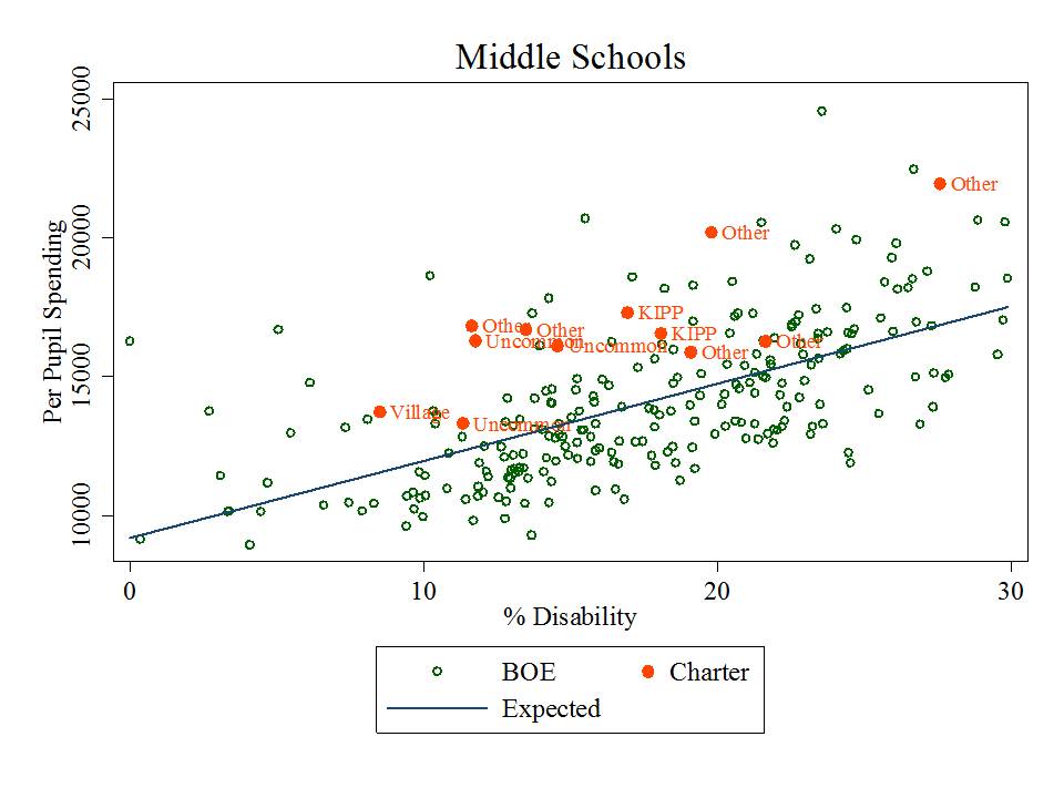
My recent report, and forthcoming article with expanded analyses, on New York City charter schools shows that most substantially outspend NYC BOE schools serving similar student populations and the same grade levels.  Figure 3 shows the scatterplot of middle schools by special education population share (where special education population is the strongest predictor of school site spending differences for NYC BOE schools).

Figure 3. Site Based Spending and % Special Education in NYC Middle Schools

Slide3

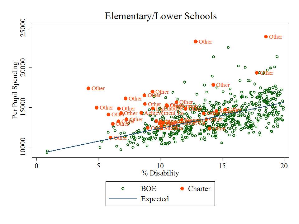
Figure 4 shows the elementary schools.

Figure 4. Site Based Spending and % Special Education in NYC Elementary Schools

Slide4

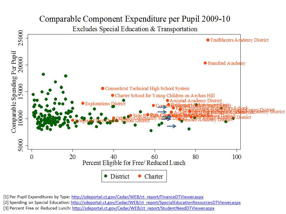
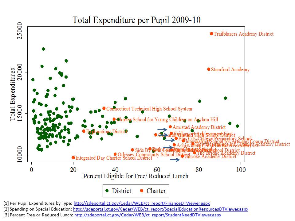
Figure 5 shows the total expenditures per pupil for Connecticut district and Charter schools. It would appear from Figure 5 that charter schools are getting the short end of the stick? Right? Especially those high flying charters like Amistad and Achievement First in Bridgeport? The problem with this comparison is that it is the host districts that are responsible for financing transportation costs, and ultimately responsible for serving children with disabilities (including/especially severe disabilities) and the expenditures for transportation and special education (including transportation of charter students) are reported on district expenditures.

Figure 5. Total Expenditures per Pupil for Connecticut District & Charter Schools

Slide9

When we pull out transportation and special education spending the picture changes quite substantially as shown in Figure 6. The charter schools are doing reasonable well in comparable expenditures per pupil – setting aside lengthy discussion of chartery misrepresentations of comparisons of facilities costs (the classic charter reactionary argument being that charters in a state like CT spend about $1700 per pupil on facilities, whereas district facilities are supposedly “free.” Even if that was the case, many CT charters would still be ahead. But, district facilities also come with maintenance costs and long term debt payments [which yes, are expenditures] that while not equaling charter lease payments as a share of operating expense, they do close the supposed gap quite substantially – see lengthy note below).

Figure 6. Comparable Expenditures per Pupil for Connecticut District & Charter Schools

Slide10

Collateral Damage of the Parasitic Chartering Model

In previous posts I showed how the population cream-skimming effect necessarily leads to an increasingly disadvantaged student population left behind in district schools. High need, urban districts that are hosts to increasing shares of cream-skimming charters become increasingly disadvantaged over time in terms of the students they must serve.

It would be one thing if state policies were in some way trying to intervene to scale up district resources to mitigate this damage. It would be one thing if we could count on charter advocates/pundits to support public policy that would help local districts deal with these (intended) consequences.

But again, the overarching incentives do not favor such advocacy. Resources are finite, and in the never ending quest to “win” the chartery success wars, it is in the interest of charter advocates to do whatever they can to get the largest share of the resources, and not care so much whether district schools get anything. In fact, it’s easier to win if they don’t.

I was not initially so cynical as to believe that charter advocates would seemingly endorse persistent deprivation of needy traditional districts in their own effort to garner more resources, and “win”. But, increasingly, it seems they are. At the very least, they want what they perceive to be their share, regardless of consequences for district schools. We see this in the persistent drive for access to facilities in New York City, subtle shifts in charter vs. district subsidy rates that appear to advantage the charters (see IBO reports) and the continued flood of philanthropy.

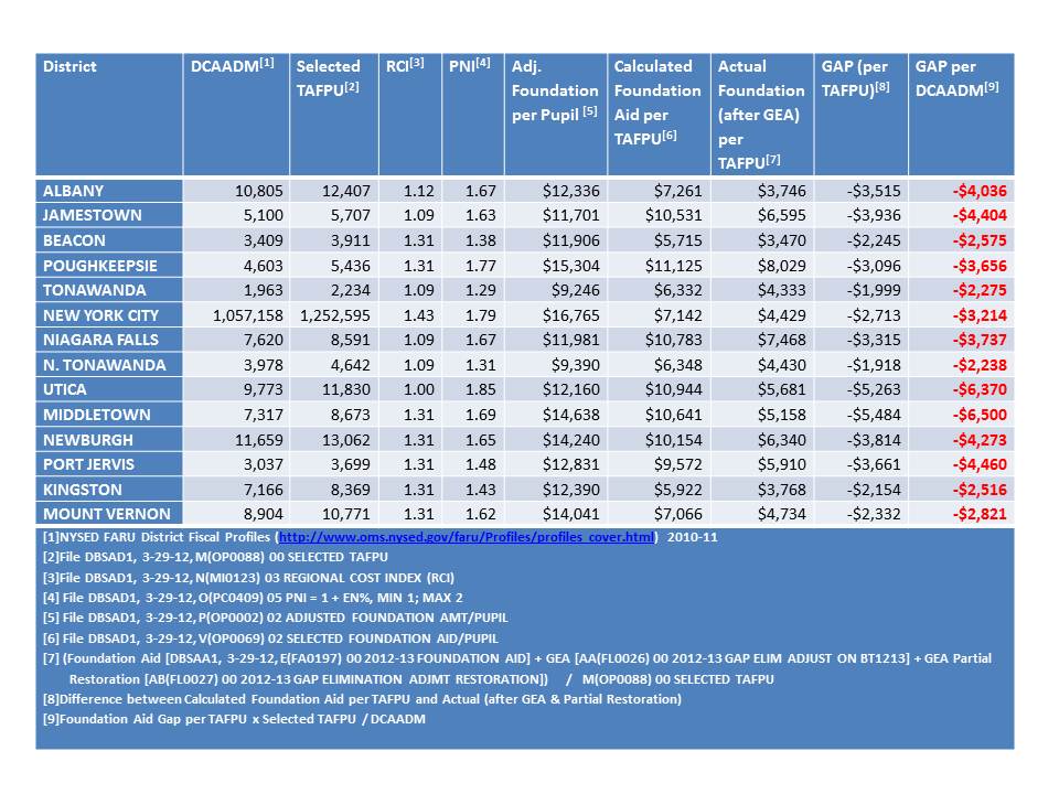
Meanwhile, what is the status of funding for high need districts in New York State? Well, Table 2 summarizes the current degrees of underfunding of New York State’s school finance formula.

Several high need districts are “underfunded” on the state’s own formula by thousands per pupil, including New York City. And where is the outcry from charter advocates that their hosts are being underfunded?

Table 2. Underfunding of New York State’s foundation formula

Slide12

Districts are starting to get fed up. But they still seem to lack the sex appeal (or bank accounts) and media access of leading charter advocates.

Yet, we don’t hear the cry from charter advocates to support the formula. Doing so might actually increase the pass through funds to charters. But, well endowed charters can offset whatever losses they might face by an underfunded formula… and be that much more likely to “win!” Is that really in the public interest? When is the last time you heard a charter advocate argue for fully funded the state aid formula (as opposed to mandating specifically an increase to their allotment of it).

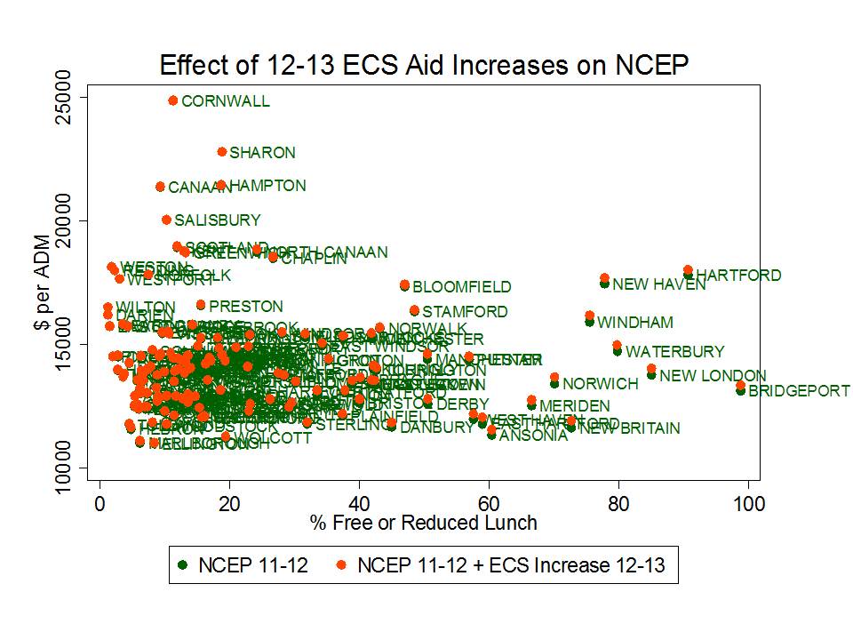
Connecticut provides a similar case of collateral damage. Figure 7 shows the per pupil increases in the Education Cost Sharing formula adopted for the current year, over prior year spending levels. In short, it ain’t much! Okay… it’s actually next to nothing. Persistent inequities exist between higher and lower need districts, and for that matter, among higher need districts (notably, Hartford and New Haven spending in this graph are distorted by magnet school aid, some of which is spent on kids from other districts).

In the same year, the CT legislature did manage to more significantly increase charter school funding (on the order of $2k per pupil), despite the fact that many charter schools were both serving lower need student populations and already spending more per pupil on a comparative basis than their host districts. Why? Well, first of all, it’s a lot cheaper – takes much less total funding increase – to increase funding for just charter kids. Second, that’s where the current punditry is – with charter advocates successfully conveying their (false) message of severe fiscal disadvantage. Pauvre, Pauvre Charter Schools?

Meanwhile, charters like Achievement First in Bridgeport seem more than happy to take their windfall and allow their “competition” (Bridgeport Public Schools) to languish.  It is indeed easier to win that way. And that seems to be what it’s all about.

Figure 7. 2012-13 increases to District Funding in Connecticut

Slide11

Closing Thoughts

It’s quite sad that we’ve reached this stage. As I envisioned it from the outset (or early on, around the late 1990s), it wasn’t supposed to turn out this way. It would, in theory be possible to establish an avenue for creative experimentation, increased flexibility – for appropriately moderated disruptive innovation and cagebusting leadership. It might even all fit into a portfolio model. Yeah… we could use all of the reformy language to describe what might have been a far more reasonable, thoughtful extension of chartering.

But alas, the potential for charters to contribute positively to the public good, in my view, has been severely compromised in part by the ill conceived incentive framework policymakers and pundits have wrapped around the concept of chartering.  Unfortunately, for the foreseeable future it is all too convenient for them to perpetuate this faulty incentive system. Yeah… the public is catching on, and eventually this too shall pass. The only question is just how much damage will have been done before we turn the corner.

[final side bar: Among the damages not discussed herein, but discussed in a previous post, are the increasing shares of students, primarily in urban districts serving low income children and minorities that will be forced to forgo constitutional rights and statutory protections that would be available to them in true public schools, in order to gain access to the only available charter schools. Sadly, many charters have chosen as one method to improve their chance of winning, discipline policies & requirements that would be impermissible in “public” schools (in legalize “state actors”)].

Notes:

[1] Footnote #22  from: http://nepc.colorado.edu/files/rb-charterspending_0.pdf

A study frequently cited by charter advocates, authored by researchers from Ball State University and Public Impact, compared the charter versus traditional public school funding deficits across states, rating states by the extent that they under-subsidize charter schools. The authors identify no state or city where charter schools are fully, equitably funded.

But simple direct comparisons between subsidies for charter schools and public districts can be misleading because public districts may still retain some responsibility for expenditures associated with charters that fall within their district boundaries or that serve students from their district. For example, under many state charter laws, host districts or sending districts retain responsibility for providing transportation services, subsidizing food services, or providing funding for special education services. Revenues provided to host districts to provide these services may show up on host district financial reports, and if the service is financed directly by the host district, the expenditure will also be incurred by the host, not the charter, even though the services are received by charter students.

Drawing simple direct comparisons thus can result in a compounded error: Host districts are credited with an expense on children attending charter schools, but children attending charter schools are not credited to the district enrollment. In a per-pupil spending calculation for the host districts, this may lead to inflating the numerator (district expenditures) while deflating the denominator (pupils served), thus significantly inflating the district’s per pupil spending. Concurrently, the charter expenditure is deflated.

Correct budgeting would reverse those two entries, essentially subtracting the expense from the budget calculated for the district, while adding the in-kind funding to the charter school calculation. Further, in districts like New York City, the city Department of Education incurs the expense for providing facilities to several charters. That is, the City’s budget, not the charter budgets, incur another expense that serves only charter students. The Ball State/Public Impact study errs egregiously on all fronts, assuming in each and every case that the revenue reported by charter schools versus traditional public schools provides the same range of services and provides those services exclusively for the students in that sector (district or charter).

Charter advocates often argue that charters are most disadvantaged in financial comparisons because charters must often incur from their annual operating expenses, the expenses associated with leasing facilities space. Indeed it is true that charters are not afforded the ability to levy taxes to carry public debt to finance construction of facilities. But it is incorrect to assume when comparing expenditures that for traditional public schools, facilities are already paid for and have no associated costs, while charter schools must bear the burden of leasing at market rates – essentially and “all versus nothing” comparison. First, public districts do have ongoing maintenance and operations costs of facilities as well as payments on debt incurred for capital investment, including new construction and renovation. Second, charter schools finance their facilities by a variety of mechanisms, with many in New York City operating in space provided by the city, many charters nationwide operating in space fully financed with private philanthropy, and many holding lease agreements for privately or publicly owned facilities.

New York City is not alone it its choice to provide full facilities support for some charter school operators (http://www.thenotebook.org/blog/124517/district-cant-say-how-many-millions-its-spending-renaissance-charters). Thus, the common characterization that charter schools front 100% of facilities costs from operating budgets, with no public subsidy, and traditional public school facilities are “free” of any costs, is wrong in nearly every case, and in some cases there exists no facilities cost disadvantage whatsoever for charter operators. Baker and Ferris (2011) point out that while the Ball State/Public Impact Study claims that charter schools in New York State are severely underfunded, the New York City Independent Budget Office (IBO), in more refined analysis focusing only on New York City charters (the majority of charters in the State), points out that charter schools housed within Board of Education facilities are comparably subsidized when compared with traditional public schools (2008-09). In revised analyses, the IBO found that co-located charters (in 2009-10) actually received more than city public schools, while charters housed in private space continued to receive less (after discounting occupancy costs). That is, the funding picture around facilities is more nuanced that is often suggested.

Batdorff, M., Maloney, L., May, J., Doyle, D., & Hassel, B. (2010). Charter School Funding: Inequity Persists. Muncie, IN: Ball State University.

NYC Independent Budget Office (2010, February). Comparing the Level of Public Support: Charter Schools versus Traditional Public Schools. New York: Author, 1.

NYC Independent Budget Office (2011). Charter Schools Housed in the City’s School Buildings get More Public Funding per Student than Traditional Public Schools. New York: Author. Retrieved April 24, 2012, from http://ibo.nyc.ny.us/cgi-park/?p=272.

NYC Independent Budget Office (2011). Comparison of Funding Traditional Schools vs. Charter Schools: Supplement. New York: Author .Retrieved April 24, 2012, from http://www.ibo.nyc.ny.us/iboreports/chartersupplement.pdf.

Note: The average “capital outlay” expenditure of public school districts in 2008-09 was over $2,000 per pupil in New York State, nearly $2,000 per pupil in Texas and about $1,400 per pupil in Ohio. Based on enrollment weighted averages generated from the U.S. Census Bureau’s Fiscal Survey of Local Governments, Elementary and Secondary School Finances 2008-09 (variable tcapout): http://www2.census.gov/govs/school/elsec09t.xls

When Dummy Variables aren’t Smart Enough: More Comments on the NJ CREDO Study

This is  a brief follow up on the NJ CREDO study, which I wrote about last week when it was released. The major issues with that study were addressed in my previous post, but here, I raise an additional non-trivial issue that plagues much of our education policy research. The problems I raise today not only plague the CREDO study (largely through no real fault of their own…but they need to recognize the problem), but also plague many/most state and/or city level models of teacher and school effectiveness.

We’re all likely guilty at some point in time or another – guilty of using dummy variables that just aren’t precise enough to capture what is that we are really trying to measure. We use these variables because, well, they are available, and often, greater precision is not. But the stakes can be high if using these variables leads to misclassification/misidentification of schools for closure, teachers to be dismissed, or misidentification of supposed policy solutions deserving greater investment/expansion.

So… what is a dummy variable? Well, a dummy variable is when we classify students as Poor or Non-poor by using a simple, single income cut-off and assigning, for example, the non-poor a value 0f “0” and poor a value of “1.” Clearly, we’re losing much information when we take the entire range of income variation and lump it into two categories. And this can be consequential as I’ve discussed on numerous previous occasions. For example, we might be estimating a teacher effectiveness model and comparing teachers who each have a class loaded with 1s and  few 0s.  But, there’s likely a whole lot of variation across those classes full of 1s – variation between classrooms with large numbers of very low income, single parent & homeless families versus the classroom where those 1s are marginally below the income threshold.

For those who’ve not really pondered this, consider that for 2011 NAEP 8th grade math performance in New Jersey, the gap between non-low income and reduced lunch kids (185% income threshold for poverty) is about the same as the gap between free (130% income level) & reduced!

Slide4

The NJ CREDO charter school comparison study is just one example. CREDO’s method involves identifying matched students who attend charter schools and districts schools based on a set of dummy variables. In their NJ study, the indicators included an indicator for special education status and an indicator for children qualified for free or reduced priced lunch (as far as one can tell from the rather sketchy explanation provided). If their dummy variable matches, they are considered to be matched – empirically THE SAME. Or, as stated in the CREDO study:

…all candidates are identical to the individual charter school student on all observable characteristics, including prior academic achievement.

Technically correct – Identical on the measures used – but identical? Not likley!

The study also matched on prior test score, which does help substantially in providing additional differentiation within these ill-defined categories. But, it is important to understand that annual learning gains  – as well as initial scores/starting point – are affected by a child’s family income status. Lower income, among low income, is associated with increased mobility (induced by housing instability). Quality of life during all those hours kids spend outside of school (including nutrition/health/sleep, etc.) affect childrens’ ability to fully engage in their homework and also likely affect summer learning/learning loss (access to summer opportunities varies by income/parental involvement, etc.). So – NO – it’s not enough to only control for prior scores. Continued deprivation influences continued performance and performance growth. As such, this statement in the CREDO report is quite a stretch (but is typical, boilerplate language for such a study):

The use of prior academic achievement as a match factor encompasses all the unobservable characteristics of the student, such as true socioeconomic status, family background, motivation, and prior schooling.

Prior scores DO NOT capture persistent differences in unobservables that affect the ongoing conditions under which children live, which clearly affect their learning growth!

Now, one problem with the CREDO study is that we really don’t know which schools are involved in the study, so I’m unable here to compare the demographics of the schools actually included among charters with district schools. But, for illustrative purposes, here are a few figures that raise significant questions about the usefulness of matching charter students and district students on the basis  of “special education” as a single indicator, and “free AND reduced” lunch qualification as a single indicator.

First, here are the characteristics of special education populations in Newark district and charter schools.

Slide1As I noted in my previous post, nearly all special education students in Newark Charter schools have mild specific learning disabilities and the bulk of the rest have speech impairment.  Yet, students in districts schools who may have received the same dummy variable coding are far more likely to have multiple disabilities, mental retardation, emotional disturbance, etc. It seems rather insufficient to code these groups with a single dummy variable… even if the classifications of the test-taker population were more similar than those of the total enrolled population (assuming many of the most severely disabled children were not in that test-taker sample?).

Now, here are the variations by income status – first for district and charter schools in the aggregate:

Slide2

Here, charters in Newark as I’ve noted previously, generally have fewer low income students, but they have far fewer students below the 130% income threshold than they do between the 130% and 185% thresholds. It would be particularly interesting to be able to parse the blue regions even further as I suspect that charters serve an even smaller share of those below the 100% threshold.  Using a single dummy variable, any child in either the red or blue region was assigned a 1 and assumed to be the same (excuse me… “IDENTICAL?”). But, as it turns out, there is about twice the likelihood that the child with a 1 in a charter school was in a family between the 130% and 185% income thresholds. And that may matter quite a bit, as would additional differences within the blue region.

Here’s the distribution of free vs. reduced price lunch across NJ charter schools – among their free/reduced populations.

Slide3

While less than 10% of the free/reduced population in NPS is in the upper income bracket, a handful of Newark Charter schools – including high flyers like Greater Newark, Robert Treat and North Star, have 20% to 30% of their (relatively small) low income populations in the upper bracket of low income. That is, for the “matched child” who attended Treat, North Star or Greater Newark there was a 2 to 3 times greater chance than for the their “peer” in NPS that they were from the higher (low) income group.

Again… CREDO likely worked with the data they have. However, I do find inexcusable the repeated sloppy use of the term “poverty” to refer to children qualified for free or reduced price lunch, and the failure of the CREDO report to a) address any caveats regarding their use of these measures or b) provide any useful comparisons of the differences in overall demographic context between charter schools and district schools.

The Secrets to Charter School Success in Newark: Comments on the NJ CREDO Report

Today, with much fanfare, we finally got our New Jersey Charter School Report. The unsurprising findings of that report are that charter schools in Newark in particular seem to be providing students with greater average annual achievement gains than those of similar (matched) students attending district schools. Elsewhere around the state charter schools are pretty much average.

Link to report: http://credo.stanford.edu/pdfs/nj_state_report_2012_FINAL11272012.pdf

So then, the big question is, what exactly is behind the apparent success of Newark Charter schools – or at least some of them enough to influence the analysis as a whole – that makes them successful? Further, and perhaps more importantly, is there something about these schools that makes them successful that can be replicated?

The General Model

Allow me to start by pointing out that the CREDO study uses its usual approach  – a reasonable one given data and system constraints, of identifying matched sets of students from feeder schools (or areas) who end up in district schools and in charter schools. CREDO then compares (estimates) the year to year test score gains of students in the charter and district schools.

The CREDO approach, while reasonable, simply can’t sort out which component of student achievement gain is created by “school factors” (such as teacher quality, length of day/year, etc.) and which factors are largely a function of concentrating non-low income, non-ell, non-disabled females in charter schools while concentrating the “others” in district schools.

School Effect = Controllable School Factors + Peer Group & Other Factors

In other words, we simply don’t know what component of the effect has to do with school quality issues that might be replicated and what component has to do with clustering kids together in a more advantaged peer group. Yes, the study controls for the students’ individual characteristics, but no, it cannot sort out whether the clustering of students with more or less advantaged peers affects their outcomes (which it certainly does). Lottery-based studies suffer the same problem, when lotteried in and lotteried out students end up in very different peer contexts. Yes, the sorting mechanism is random, but the placement is not. The peer selection effect may be exacerbated by selective attrition (shedding weaker and/or disruptive students over time). And Newark’s highest flying charter schools certainly have some issues with attrition.

Given my numerous previous posts, I would suggest Figure 1 as the general model of the secrets of Newark Charter School success.

Figure 1. The General Model

Put simply, while resource use – additional time, compensation, etc. – may be part of the puzzle – the scalable part – the strong sorting patterns of students into charter and district schools clearly play some role – a substantial role – and one that constrains our ability to use “chartering” as a broad-based public policy solution.

One Part Segregation

Let’s start by taking a look at the most recent available data on the segregation of students by disability status, free lunch status, gender and language proficiency. Now, the CREDO report is careful to point out that charter school enrollments match the demographics of their feeder schools – and uses this finding as an indication that therefore charter schools aren’t cream-skimming. That’s all well and good…. EXCEPT … that for some (actually many) reason, charter schools themselves end up having far fewer of the lowest income students. See Figure 2.

Figure 2. % Free Lunch

Now, one technical quibble I have with the CREDO report is that it relies on the free/reduced priced lunch indicator to identify economic disadvantage (and then sloppily throughout refers to this as “poverty”). I have shown on numerous previous occasions that Newark charters tend to serve larger shares of the less poor children and smaller shares of the poorer children. So, it is quite likely that the CREDO matched groups of students actually include disproportionate shares of “reduced lunch” children for charters and “free lunch” children sorted into district schools. This is a non-trivial difference! [gaps between free lunch and reduced lunch students tend to be comparable to gaps between reduced lunch and non-qualified students.]

Here are the other sorting issues:

Figure 3. % ELL/LEP

Figure 4. % Female


Figure 5 shows that not only do charter schools in Newark tend to serve far fewer children with disabilities, they especially serve few or no students with more severe disabilities. In fact, they serve mainly students with Specific Learning Disabilities and Speech Language Impairment. Given the data in Table 5, it is actually quite humorous – if not strangely disturbing – that the CREDO study attempted to parse the relative effectiveness of district and charter schools at producing outcomes for children with disabilities using only a single broad classification [Student matching was based on a single classification, creating the possibility that children with speech language impairment in charters were being compared with children with mental retardation and autistic children in district schools. It is likely that most students who took the assessments were those with less severe disabilities in both cases.].

Figure 5. Special Education Distributions

Here are some related findings from (and links to) previous posts

Newark Charter Effects on NPS School Enrollments

New Jersey Charter School Special Education

Newark Charter School Attrition Rates

Here are just a few visuals of how the free lunch shares and female student test-taker shares relate to general education proficiency rates on 8th grade math. Both are relatively strong determinants of cross-school proficiency. And both with respect to gender balance and free lunch balance, Newark Charter schools are substantively different from their district school counterparts.

Figure 6: 8th Grade Math & % Free Lunch

Figure 7: 8th Grade Math & % Female


Now, these are performance level differences, which are not the same as the gain measures estimated in the CREDO study. But, I’ve chosen the 8th grade scores because that is when the charter scores tend to pull away from the district school scores (that is, these are the score levels at the tail end of achieving greater gains). But, the contexts of the gains for charter students are so substantially different from the contexts of achievement gains for district school students that scalability is highly questionable.

As I’ve said before – There just aren’t enough non-disabled, non-poor, fluent English speaking females in Newark to fully replicate district-wide the successes of the city’s highest flying charters.

One Part Compensation

Now, I’ve also written many posts which address the resource advantages and some resource allocation issues for high flying New York City charter schools, which a) also promote substantial student population segregation and b) have been shown in numerous studies to yield positive achievement gains.

I do not intend to imply by my above critique that peer group effect is necessarily the ONLY effect driving Newark Charter’s supposed success. The problem is that because high flying Newark Charters in particular serve such uncommon student populations we can never really sort out the peer group versus school quality effects.

It is certainly reasonable to assume that the additional time and effort spent with these students in some schools – even though they are a more advantaged (less disadvantaged) group – makes a difference.  No excuses charters in Newark like those in New York City tend to provide longer school days and longer school years, and importantly, they compensate their teachers for the additional time & effort. Here’s a simple chart of the average teacher compensation for early career teachers in NPS and Newark Charters. NPS teachers catch back up in later years, but as I’ve pointed out in numerous previous posts, a handful of Newark charters have adopted the reasonable (smart) competitive strategy of leveraging higher salaries and salary growth at the front end to improve teacher retention and recruitment.

Figure 9: Newark Teacher Compensation

Below is a more precise comparison that teases out the differences that aren’t so apparent in Figure 9. For Figure 10, I have used 3 years of data on teachers to estimate a regression model of teacher salaries as a function of experience, degree level and data year.

Some of Newark’s “high flying charters” [North Star, Gray, TEAM] tend to substantially outpace salaries of NPS teachers over the first ten years of a teacher career. Few of these schools have any teachers with more years of experience than 10. Other Newark charter schools maintain at least relatively competitive salaries with NPS.

Now, a critical point here is that as I’ve shown above, teaching in many of these schools comes with the perk of working with a much more advantaged student population. As such,  it is conceivable that even a comparable wage provides recruitment advantage – given the student population difference. Clearly, a higher wage provides a significant recruitment advantage – though in the case of the highest paying school(s), the elevated salary comes with substantial additional obligations.

Figure 10. Modeled Teacher Salary Variation by Experience

Closing Thoughts

So, when all is said and done, this new “charter school” report like many that have come before it leaves us sadly unfulfilled, at least with respect to its potential to provide important policy insights. Most cynically, one might argue the main finding of the report is simply that cream-skimming works – generates a solid peer effect that provides important academic advantages to a few – and serving a few is better than serving none at all (assuming the latter is really the alternative?). Keep it up!  Don’t worry ’bout the rest of those kids who get shuffled off into district schools. Quite honestly, given the huge, persistent differences in student populations between high flying Newark charters and districts schools, and given the relatively consistency of research on peer group effects, it would be shocking if the CREDO report had not found that Newark charters outperform district schools.

While it is likely that there exists some strategies employed by some charters (as well as some strategies employed by some district schools) that are working quite well – THE CREDO REPORT PROVIDES ABSOLUTELY NO INSIGHTS IN THIS REGARD.  It’s a classic “charter v. district” comparison – where it is assumed that “chartering” represents one set of educational/programmatic strategies and “districting” represents another – when in fact, neither is true (see the scatter of dots in my plots above to see the variations in each group!).

What do the available data tell us about NYC charter school teachers & their jobs?

This post is about rolling out some of the left over data I have from my various endeavors this summer.  These data include data from New York State personnel master files (PMFs) linked to New York City public schools and charter schools, NYC teacher value-added scores, and various bits of data on New York City charter and district schools including school site budget/annual financial report information.

Here, I use these data combined with some of my previous stuff, to take a first, cursory shot at characterizing the teaching workforce of charter school teachers in New York City. All findings use data from 2008 to 2010.

To summarize the following figures, New York City charter school teachers:

  1. Are relatively inexperienced (but not all in their first 3 years)
  2. Are young (but not all 22 or 23 years old)
  3. Have longer contract years
  4. Are paid well for their experience, with a portion of the additional pay covering the additional time
  5. Have smaller classes to teach
  6. Work in schools that spend much more than surrounding district schools
  7. Work in schools that serve much less needy student populations than surrounding district schools
  8. Have 4th grade students with relatively “average” to below average scale score outcomes compared to schools serving similar populations
  9. In some cases, have 8th grade students with high average scale score outcomes compared to schools serving similar populations
  10. Where data were available, have value-added scores which vary from the citywide average in both directions, with KIPP being the lowest and Uncommon schools the highest (in the aggregate). Notably, Uncommon schools also have consistently smaller class sizes and the fewest low income students.

That’s it. Nothing particularly surprising. Nothing astounding. No miracles, but, a subset of schools that are in some ways different from district schools. Further, they are different in ways that perhaps aren’t that sexy… aren’t that “reformy.” Salaries rise with experience and they just happen to rise faster than district school salaries in some cases. Class sizes are small… especially at the middle school level… even though we are often told that class size reduction is only important in early grades. And, well, the outcomes are kind of mixed.

Experience & Age

The first figure shows that the typical NYC charter school teacher has about 6 tears experience in 2010. Some anomalies occur in the 2008 data. NYC district school teachers have about double that. But, it should be noted that some of this difference is likely explained by the average age of the schools themselves, in addition to higher turnover (a topic for a later date).

One would expect that as the schools mature, their staff will also somewhat – unless they actually make a concerted effort to excess teachers beyond a specific experience level. If they do begin to accumulate more experienced staff, they will also accumulate the higher expenses associated a more experienced staff and accumulated retirees (assuming any stay long enough to retire from these schools).

The average charter school teacher is between 25 and 30 years old, compared to the average district school teacher being around 40.

I’ll admit, I’m having some trouble reconciling average years of experience being around 6 and age around 25, but it would appear for the most part that the experience and age line up such that most went directly into teaching from their undergraduate studies. That is, there aren’t likely many later career changers here.

Contracts & Compensation

Personnel master file data report that teachers in Harlem Village Academies, Achievement First, KIPP, Uncommon and Lighthouse schools are on 11 and 12 month contracts. Harlem Childrens’ Zone was similar but did not report 2010 data. By contrast BOE contracts were 10 month (according to averages taken from full time individual teachers in the data).

Average salaries were highest in 2010 in KIPP schools, with BOE schools second, and other high profile charter chains not far behind. However, these averages are a function of degree levels, experience levels and contract months.

So, we can use a regression model to isolate those effects and compare “otherwise similar” teachers, and to determine the wage differential associated with the additional contract months (to the extent that contract months vary within the charters).

This next figure uses a regression model to compare the salaries of “otherwise similar” teachers by job classification, full time status, degree and experience level.  On average, a teacher with all of the same attributes can make a salary that is $8,000 higher in an Ucommon school and nearly $6,000 higher in an Achievement First School. Teachers in HCZ and KIPP schools make an annual salary about $4,000 higher than those in BOE schools.  Controlling for months worked, KIPP and HCZ salaries are comparable to district salaries and Uncommon and Achievement First salaries remain higher.

I’ve often asserted that many teachers might be willing to/interested in working a longer year for a higher annual salary. After all, it might be desirable to earn more doing what you do best and are professionally trained to do, rather than searching for other part time Summer work that does not always take advantage of your expertise.  That may not be the case for all teachers, but would likely be the case for at least some (as it is for these charter teachers). More pay for more time. Makes sense.

The following figure uses the regression model to lay out the predicted salaries for a teacher in 2009 across experience levels. Notably, much like BOE school salaries, NYC charter teacher salaries do increase with experience. In particular, consistent with what I’ve shown previously for salaries in Texas, New Jersey and Connecticut high profile charters, Achievement First and Uncommon schools pay what appears to be a significant salary premium. None pay significantly less than district schools, and none are flat with respect to experience (like Gulen school salaries in NJ or TX). KIPP and others track for the most part with district salaries.

Resources & Working Conditions

Now, not to beat an issue into the ground, but the following figure summarizes the per pupil operating expenditure differences between NYC charters and district schools (with the data becoming cleaner, more accurate and precise each time I take a swipe at them). These margins of difference are ever so slightly higher than those in my previous study, but the model is similar. High profile charters in NYC substantially outspend district schools serving similar student populations.

I’ve addressed critiques of these figures previously and have provided sensitivity analysis and discussion here: https://schoolfinance101.wordpress.com/2012/05/07/no-excuses-really-another-look-at-our-nepc-charter-spending-figures/

The full length report on these and related figures is here:

  • Baker, B.D., Libby, K., & Wiley, K. (2012). Spending by the Major Charter Management Organizations: Comparing charter school and local public district financial resources in New York, Ohio, and Texas. Boulder, CO: National Education Policy Center. Retrieved [date] from http://nepc.colorado.edu/publication/spending-major-charter.

Now, for this next figure, I use a regression model to compare the demographics of NYC charter schools to district schools, where the dependent measure is the population characteristic, and the independent measures include a) grade range served, b) year of data and c) borough of location of the school. That is, these comparisons are of the student population compared to same grade level schools in the same borough.

Uncommon schools in particular have uncommonly low rates of the lowest income children. This is typical in New Jersey as well (for North Star Academy in Newark). They also have low LEP/ELL rates, but so do they all. Achievement First and KIPP schools also have low rates of the lowest income children – quite a bit lower than district schools. Success Academies in particular have very low rates of LEP/ELL children. All have relatively low rates of children with disabilities.

These differences – when combined – make for very different school environments than for district schools in the same borough.

Now, despite serving much less needy student populations, these charter schools tend to have much smaller class sizes than district schools serving the same grade levels. HCZ schools have small elementary and middle school class sizes – from six to eight fewer students in a class than district schools. Uncommon schools have very small middle grades classes, as do Village Academies and Achievement First Schools. Interestingly, despite their financial dominance, KIPP schools have smaller class sizes than district schools, but not to the extent of others (note that some of KIPPs financial resources are allocated to such endeavors as KIPP to College).

A really interesting twist here is that the emphasis on smaller classes appears to be at the middle school level.  My gut instinct as a former middle school science teacher tells me that this makes sense. But, if one sticks strictly to the strongest findings in research literature, one would expect targeting at the elementary level and would have less justification for targeting small classes to the middle level. But perhaps small middle school class sizes are actually part  of the secret sauce of successful charter schools?

NYSED School Report Cards: https://reportcards.nysed.gov/

Outcomes

Now, with smaller class sizes, higher paid teachers working longer years, and less needy students we would not only expect a higher average performance level, but we’d also likely expect some higher average rates of gain in these schools.  And lottery based studies of NYC charters have revealed some positive findings of differences in performance between lotteried in and lotteried out students. It’s critically important to understand that while the sorting process may have been randomized in these studies the contexts – peer groups, etc. – into which they’ve been sorted is anything but. Again, different peers, different levels of resources – class sizes – length of year – teacher salaries, etc.  And some of this stuff is the stuff of difference that is of particular interest for setting policy.

The figures I offer below are merely descriptive. Again I use regression models to compare the outcomes of schools that are similar in terms of students served. But regression models in this case are used for descriptive purposes (as they often are). I’m really just describing the average difference in outcomes between the charters and schools serving similar populations. In the third slide below, I do use the average teacher value-added outcomes for those schools – but note that very few teachers in any given NYC school actually have sufficient numbers of students in tested grade levels for generating the value added estimates.

In the first figure here, we see that 4th grade assessment performance in many NYC charters is, on average, lower than district schools. The vertical axis indicates the number of points (around a mean near 680) above or below the mean of similar district schools. Most differences are well less than 1 standard deviation ( which is about 17 pts., but a standard deviation would be a pretty big difference. Again, these are levels, not gains.). 4th grade math scores are higher in Uncommon and Achievement First Schools. Most other 4th grade scores are similar to or lower than district schools. In v1 (version 1) models, I use % free or reduced price lunch (which varies little across many of these schools) and in Version 2, I use percent Free only. Charter schools compare less favorably when I evaluate them on the basis of their free lunch populations alone.

Uncommon Schools and Village Academies appear somewhat stronger on their eight grade performance, while others are a mixed bag. Again, these are level – scale – scores, relative to schools serving similar populations. Now, there has been at least some discussion of attrition as a factor in Village Academy performance. I’ve personally found attrition to be a major issue in Uncommon’s Newark School, North Star. But that’s an issue for another day.Matt Di       Carlo over at Shankerblog did a nice explanatory piece on the role of attrition the other day.

Here, what we have are average scale scores that are quite a bit higher than “demographically similar” schools. That said, when I account for free lunch instead of free or reduced lunch, those differences are somewhat muted. That is, when I compare against schools with comparable shares of the lowest income children, positive charter performance differences are muted and negative ones larger.

Again, Harlem Chidlrens’ Zone scores are relatively low, especially when comparing on the basis of fee lunch (v2 models). KIPP scores are pretty much comparable to demographically similar schools and Achievement First and others a mixed bag.

Finally, this figure shows the average value-added scores for teachers in these schools. Uncommon Schools are the only ones that appear to have noticeably above average teachers. One might stretch the data here beyond their capacity to argue that perhaps Uncommon schools are getting results for the premium they pay their teachers… and the fact that they generally provide those teachers with smaller classes. Not an entirely unreasonable story, though a) the underlying dynamic is likely far more complex than this and b) the value added metrics used here are anything but stable and/or decisive.

NYC Teacher Value Added Scores: http://www.ny1.com/content/top_stories/156599/now-available–2007-2010-nyc-teacher-performance-data#doereports

Implications

So, what does this all tell us? Perhaps not much… while at the same time, quite a bit more than we may have already know. At the very least, these data should serve to clear up common misconceptions & reformy misrepresentations of the NYC charter sector.

No… these schools are not staffed by peace core like, minimum wage missionaries (not that I’ve really heard this one all that much). They’re getting paid reasonably and getting paid a premium for at least some of the extra time and effort. Is it enough to sustain the model? Can these schools afford this down the road? Who knows?

No… these schools are NOT proving that money and class size don’t matter.  That would be difficult to prove with a subset of schools that for the most part spend more than district schools and provide smaller class sizes.

And No… these schools are not totally and invariably kicking butt on all student outcome measures, be they performance level measures or performance gains.

And finally… No… these schools are not doing it all… with the same kids!

But this isn’t just a laundry list of stuff to try to hold against these schools. Rather, it’s an attempt to lay out more clearly with publicly available data, what’s going on here, in an effort to move the conversation forward, beyond the usual talking points and into stuff that may really matter!

Parsing Poverty: Charter Market Segmentation across & Within U.S. Cities

Late Thursday, I posted a follow up on the distribution of children with disabilities by disability classification across charter and district schools in New Jersey and Pennsylvania. This post explores the distribution of children who qualify for free lunch in charter schools and district schools within the city limits of major cities. Note that the unit of analysis – the charter market, per se – that I am using here is the “city limits” and all schools – charter and district that lie within specific large central cities (urban centric locale code 11). Why does this matter? And why do I do it this way? One reason is data convenience. Another is that it’s important to recognize that many U.S. Cities are carved into multiple school districts, often times relating to a long history of housing and school segregation. I’ll provide some Kansas City examples below. In other words, the traditional district system already creates some artificial boundaries of segregation, onto which the charter system is now being superimposed.

Again, in this post, I’m focusing on low income children. When it comes to low income children, Charter schools in many settings do tend to serve smaller shares of the lowest income children, leaving larger shares behind in district schools. Here, my interest is in evaluating major urban centers across the country to determine the extent to which these patterns are systematic. And also, the extent to which these patterns vary by charter market share. I believe I’ve mentioned on previous posts that it seems most likely that charter schools can maintain a cream-skimmed population when charters generally have smaller market share. That is, when there’s enough cream to go around.

So, here goes… using data from the 2009 Common Core (there were more gaps in free lunch and enrollment data in 2010) of Data from NCES.

Visualizing Market Segmentation

This first figure conveys my strategy for my first cut comparisons of charter market segregation by student low income status. Imagine for any given city, there are a certain number of total enrolled students and a certain number of low income enrolled students. If charter schools in the aggregate in that city are serving an equitable share of low income children, the share of low income children served should match the overall market share. That is, if charter schools serve 10% of all children enrolled in schools in the city, then charter schools should also be serving 10% of the low income children. One can graph cities accordingly.

When charters – or the citywide charter sector as a whole are operating at parity – they will fall along the red dotted diagonal line. But, when charters are serving a lower share of low income children, they will fall below the line. When they are serving a higher share than the city schools (which may include multiple districts/entities), they will fall above the line.

Major U.S. Markets

Here, I review the charter market  share and free lunch shares for small market share cities,  medium market share cities, and large market share cities.

An important clarification is in order with regard to certain cities like New York and Boston. In the NCES Common Core, these cities are actually broken up into many separate cities. Boston is broken up into Boston (central city),  Dorchester, East Boston, etc. New York is broken up into Manhattan/New York, Bronx, Brooklyn and Queens is broken up into separate cities (essentially neighborhoods).  As such, they each appear as smaller markets than one might expect.

Small Market Share

This first figure shows markets with relatively small charter market share – less than 5% of children enrolled in charters. Circle size indicates the aggregate enrollment across charter and district schools – or market size. In most of these markets including the Bronx, New York (Manhattan) and Philadelphia the charter free lunch share is below parity. This means that these charters are leaving behind more lower income kids than they are taking in.

Medium Market Share

In lower middle-market cities, things seem to even out a bit,  but many are still below the parity line, including Newark, which I have pointed out on many occasions. San Antonio charters have a higher free lunch share than the districts serving San Antonio.

Large Market Share

In larger market share cities there seems to be even greater parity, and in Minneapolis and Kansas City it would appear that the charters on average are serving more lower income children than the district schools within the city limits. But, some caveats are in order here…

Kansas City provides an interesting case where these descriptions are perhaps a bit deceiving. Kansas City – through strategic housing planning and school district boundary planning – was carefully carved into racially identifiable neighborhoods throughout the early half of the 20th century (and then some  – actually as late as 2007).  If we look at all zip codes within the broad city limits (below) we include several school districts. Among these, we include the central city district KCMSD, but we also include the predominantly white, higher income communities north of the river. Notably, as a function of the state’s original charter statute, there are no charters north of the river (as they were only permitted in KCMSD and St. Louis originally). So, this comparison needs some tweaking and more fine grained local analysis – like that which follows.

Finally, here’s a snapshot of the largest market share cities. Notably, even in Columbus Ohio and Washington DC, with relatively large total market size and large market share, charters seem to be under-serving the lowest income students. With such large market share, one can expect that this has a significant adverse effect on district schools.

Digging into the Cities

One can take the same approach and bring it down to the zip code level within cities. Now, because of data constraints, all of these analyses focus on school enrollments of schools that happen to be located in a particular zip code. I’m not able to look, for example, at the zip codes from which the students actually come to these schools. So, one must assume there to be some fuzziness around the zip code boundaries. That some lower income students do travel outside of their zip code to attend charter schools.

Los Angeles

Across all zip codes in Los Angeles, many operate at parity, but in some cases, charters are clearly underserving low income students at least compared to district schools in the same zip code.

Zooming in on zip codes with charter market share below 10%, we can see that there are actually quite a few where low income populations are underserved, and not so many where they are significantly overserved, per se.

Philadelphia

Philadelphia displays a similar pattern across all zip codes, with low income children significantly underserved in some markets including those with relatively high charter market share (over 40%).

Focusing on zip codes with smaller market share,  we see that some particularly large markets have charter schools that are underserving low income children.

This next figure paints an alternative picture of charter market segmentation in Philadelphia. Here, I do the more typical relationship between total zip code % free lunch and charter % free lunch. But, I also include all of the zip codes that don’t have any charters. AND, I plot as squares the overall market size (total enrollment) and as circles the charter market size (charter enrollment). Yeah… way to much for any one graph… but bear with me.

So, if there is a large square, with a small circle in it, that’s a high total enrollment zip code, with relatively low charter enrollment. If there’s a smaller square with large circle, that’s a smaller zip code market with a large charter enrollment. All of those squares along the bottom are zip codes with no charter market share at all. In Philadelphia, there exist several high poverty zip codes with no charters. And there are some large high poverty zip codes with large charter market shares – BUT… where those charters are underserving low income children.

Perhaps even more interesting but not surprising is that in this predominantly low income city, there are three relatively large markets, with very large charter market share, that are NOT zip codes with high low income share. That is, the charter sector has grown and taken large market share in what might generally be considered more advantaged zip codes.

Baltimore

Here’s Baltimore (I always get asked to include Baltimore… so here it is). And Baltimore’s low charter market share zip codes display what seems to be a typical pattern, with most having charter sectors that serve fewer than expected low income children (again, those qualified for free lunch).

Larger market share zip codes are more of a mixed bag in Baltimore, as one might expect.

As with Philadelphia, we see that some charters have established in generally lower poverty zip codes, but in this case, the charters are serving a lower income population than the other schools around them. But, in the higher poverty zip codes, charters tend to be serving lower poverty populations. And this includes several of the larger markets and includes those with particularly large charter market share. Again, my policy concern here is the effect that this has on the district schools which must serve those not siphoned off into charters. And this does not include the special education or ELL sorting, which in most cases I’ve evaluated thus far tends to be more extreme.

Kansas City

I close this one out with Kansas City. Recall that it appeared that charter schools in Kansas City actually serve a larger share of low income  kids than district schools in the city. But, that finding was complicated by the fact that the city limits actually include what many might consider to be the equivalent of suburban districts (the ones presently fighting in court against accepting KCMSD students on interdistrict transfer – another story for another day).  For the most part, across all KC zip codes that have charters, charter enrollment share and free lunch share are in line – but for 64113.

Citywide, charter market shares are concentrated in higher poverty zip codes, but for one, again, as a function of district organization and the original charter statute.

But even Kansas City has some issues regarding the extent to which charter schools actually reach the lowest income neighborhoods in the city. In fact, a really cool Kauffman Foundation (Charter Advocates for the most part) report about a year ago pointed out how charters had largely established around the edges of the poorest neighborhoods but were not embedded in those communities. I discussed that report here:  https://schoolfinance101.wordpress.com/2010/10/30/biddle-me-this-or-flunkout-nation/

The maps above more or less reinforce the Kauffman report findings. On the left are zip code free lunch shares, showing the core of higher poverty up through the center of the city (blue box). Charter schools are green, district schools black. Note that charters are mostly lined up along the western edge of the blue box, and to the north toward downtown. And on the right we see that charter market shares are largest to the west of the low income core, but not within it. This is one case, however, where I’d love to have the locations of residence for the students, to see how many cross over from the poorer zip codes to attend the charters. That said, the previous figures indicate that the low income concentrations in those charters resemble their surrounding schools in the same zip code – not the low income concentrations of the poorer zip codes to the east.

Closing Thoughts

So, this brings me back to the point I’ve been reiterating over and over these past several weeks. We need to figure out how all of this stuff fits together. From a policy perspective, we need to concern ourselves with the overgrowth of schools that do not serve representative populations in part because of the effect those schools have on the others around them. Indeed, it may not be wise to force some of these schools to take on students that they simply aren’t capable of handling. As I’ve said before, perhaps some of them do well with their select population because of their select population, and perhaps they’ve learned to work well with that population.

Allowing or even encouraging an unfettered parasitic decomposition of urban schooling is not a reasonable policy solution as it will ultimately harm large numbers of the lowest income, disabled and non-English speaking students disproportionately left behind. Some market segmentation is tolerable, and existed long before charter expansion became a primary cause.

Finally, there’s also that pesky concern I have about shifting larger and larger shares of children into schools where they and their parents may be unknowingly compromising constitutional and statutory rights. I am especially concerned given that charter school market shares tend to be largest and expanding most quickly in urban settings serving low income and minority children. As such, we are moving toward a system where low income and minority children are more likely than their white suburban peers to be attending a school that calls itself public, but one in which those students may be sacrificing constitutional and statutory rights they would otherwise have in a real public institution.

Again, this is not to say that charter operators are generally out to deprive kids of rights. But rather, that legal protections for these children are being quietly eroded by the emerging ambiguities of the “public until it’s legally convenient to argue otherwise” charter sector. We need to pay attention to this erosion of rights, and its disproportionate impact on low income and minority children.

The bright spot (he opined cynically) in the figures above is that in most charter markets – which do tend to be low income cities – the lowest income children are generally being under-served by these schools.

To the extent that we wish to make charters a significant player in the mix of providing “public” schooling, these issues must be resolved (and are resolved to a greater extent in some states than others).  If charters are going to be major players here, their various layers of governance must either be explicitly considered public (board members considered public officials) with all of the statutory and constitutional obligations (and protections) of public officials (open meetings, open records, bidding, etc.), or they must be bound by the same statutory and constitutional requirements (whether labeled as public officials or not). And it must be explicitly guaranteed in state charter laws that all statutory and constitutional rights pertaining to students and employees in traditional public/government (state actors) agencies also apply to charter schools. In other words, the rhetoric of “public” must be accompanied by the legal obligations of being “public.” Alternatively, if they’re simply NOT public, then just admit that fact (and dump the whole deceptive “public” charter label and call it a voucher system instead). In which case, a true public option must be made available to all children. Simply closing down all true public options – New Orleans style – for large portions of cities, leaving only pseudo-public and true private options is also likely to disparately deprive low income and minority students of constitutional and statutory rights.

More on this topic another day….